ShaneMVP - Website Designer & Developer
YAFKO Hotel
Client: Omar B.
Date: April 2022
Category: Application
Check out my:
A Detailed Look at the Project Journey: From Initial Vision Through Obstacles to Final Outcomes
Concept
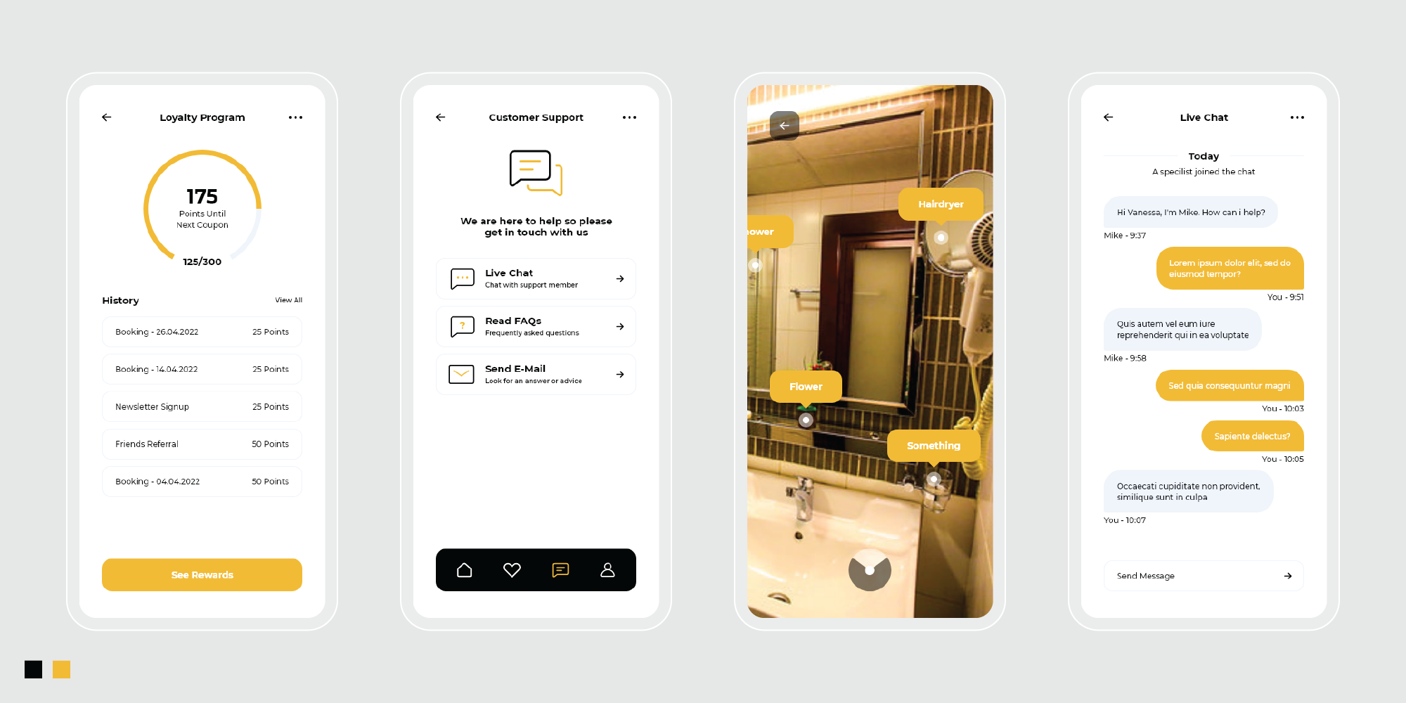
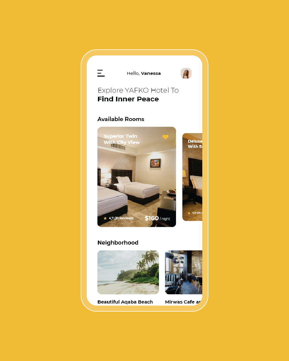
The concept for the YAFKO Hotel application revolves around creating a modern and minimalistic interface that reflects the elegance and sophistication of the hotel. The design focuses on delivering a seamless user experience for guests, from booking rooms to exploring hotel amenities. The minimalist style ensures that the app is visually appealing and easy to navigate, enhancing the overall guest experience by highlighting essential features and services without unnecessary clutter.
Challenge
The main challenge was to design an application that effectively combines modern aesthetics with functionality. The goal was to create a minimalistic interface that still provides all the necessary information and features for hotel guests, such as room reservations, amenities, and concierge services. Balancing a sleek, modern design with practical usability required careful attention to detail to ensure that the app remains both visually appealing and highly functional.
Solution
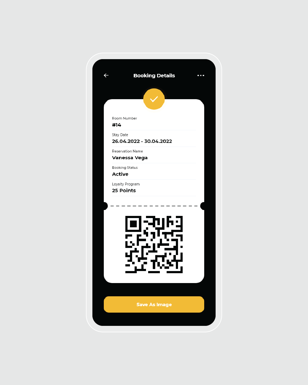
To address these challenges, I designed the YAFKO Hotel application with a clean, modern aesthetic that emphasizes simplicity and elegance. The user interface features a minimalist layout with intuitive navigation, ensuring that users can easily access key features like booking rooms and exploring hotel services. Strategic use of white space and streamlined design elements help maintain a sophisticated and uncluttered look, while carefully selected typography and iconography enhance usability.
Webpage Development
Delving into the Design: An Exploration of the Meaning Behind the Visual Elements and Creative Vision
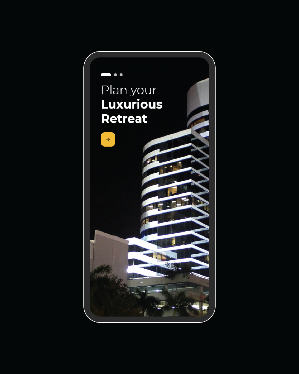
The YAFKO Hotel application design emphasizes a modern and minimalistic style to reflect the elegance and sophistication of the hotel. The minimalist approach ensures a clean, uncluttered interface that prioritizes user experience and functionality. By focusing on simplicity, the design highlights essential features and services, providing guests with an intuitive and seamless interaction. This style conveys a sense of luxury and refinement, aligning with the hotel’s high-end image and enhancing the overall guest experience.
The color palette of sophisticated yellow and black plays a crucial role in conveying the application’s high-end feel. Sophisticated yellow is used strategically to accentuate key features and calls to action, adding warmth and a touch of luxury without overwhelming the design. This color helps to create a subtle contrast and draws attention to important elements. Black, on the other hand, serves as the primary color, providing a sleek and modern backdrop that enhances the overall sophistication of the interface.
In-Depth Project Description: A Exploration of the Narrative, Design Strategy and Implementation Approach
Project Overview
The YAFKO Hotel application project involved designing a modern, minimalistic interface to enhance the guest experience and reflect the hotel's sophistication. The goal was to create an intuitive and visually appealing app that allows users to seamlessly book rooms, explore amenities, and access hotel services. The design aimed to deliver a superior user experience by focusing on a clean and streamlined interface that aligns with the hotel's upscale brand identity.
Client Expectation
The client sought a functionally perfect, highly modern, and clean application that would embody the elegance and refinement of YAFKO Hotel. They required a design that not only provides a seamless and intuitive user experience but also maintains a high standard of sophistication. The app needed to be visually striking yet simple, ensuring that all essential features were easily accessible while reflecting the hotel's luxurious and contemporary image.
My approach
To meet the client's expectations, I designed the YAFKO Hotel application with a focus on modernity and minimalism. The interface features a clean layout with intuitive navigation, ensuring that users can easily access key features and services without distraction. The use of sophisticated yellow and black in the color palette enhances the design’s elegance and refinement, aligning with the hotel’s high-end branding. By incorporating a minimalist style and strategic use of color, the design creates a visually appealing and functional app that delivers a superior user experience, meeting the client’s standards for modern sophistication.