ShaneMVP - Website Designer & Developer
River Rocks
Client: julia.winkler_rohp
Date: July 2022
Category: Logotype + Brand Guidelines
Check out my:
A Detailed Look at the Project Journey: From Initial Vision Through Obstacles to Final Outcomes
Concept
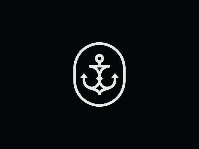
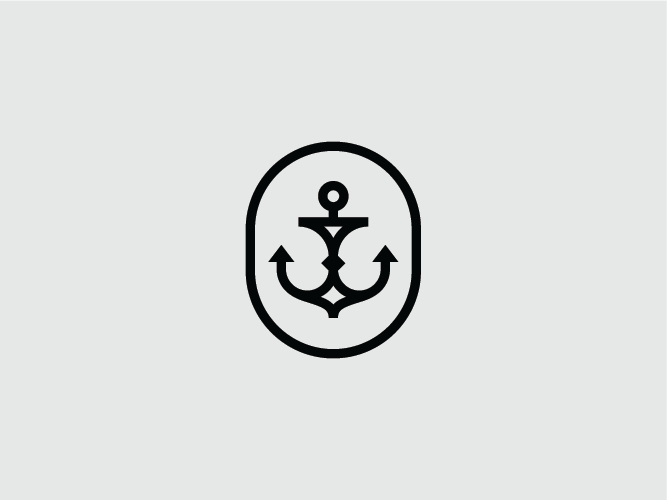
The concept for River Rocks revolves around creating a logo that embodies the spirit of watersports and the camaraderie of crew life. Drawing inspiration from the client's brief, I designed a stylized anchor as the central symbol of the logo. The anchor is a timeless maritime symbol that resonates with the brand’s focus on water activities like wakeboarding, waterskiing, and boating. To capture the essence of the target audience—those who are passionate about watersports and enjoy the laid-back, social aspect of water life—the anchor was crafted to be both unique and modern. The design is clean and cool, reflecting the brand’s commitment to a fresh, trend-conscious identity that appeals to enthusiasts who cherish their time on the water and their connection to it.
Challenge
The challenge in this project was to create a logo that stands out in a crowded market of watersports brands while remaining true to the client’s vision of individuality and coolness. The design needed to appeal to a diverse group of water enthusiasts who value both the thrill of sports and the relaxed, social aspects of river and lake life. Balancing the need for a unique, eye-catching logo with the requirement for a clean and modern aesthetic was crucial. Additionally, incorporating a special type of anchor that deviates from conventional designs posed a creative challenge, ensuring the final logo was distinctive and resonated with the target audience’s desire for trendiness and authenticity.
Solution
To address the challenge, I developed a stylized anchor that serves as a distinctive and memorable centerpiece for the River Rocks brand. The anchor design was crafted with a modern and clean approach, ensuring it is visually striking and easily recognizable. I focused on making the anchor unique by incorporating elements that reflect the dynamic and trendy nature of the target audience. The design aligns with the brand’s values by conveying a sense of freedom, relaxation, and a connection to water. By blending these elements, the logo effectively captures the essence of River Rocks, appealing to watersports enthusiasts and celebrating the crew life with a fresh and cool visual identity.
Webpage Development
Webpage Development
Webpage Development
Webpage Development
Webpage Development
Delving into the Design: An Exploration of the Meaning Behind the Visual Elements and Creative Vision
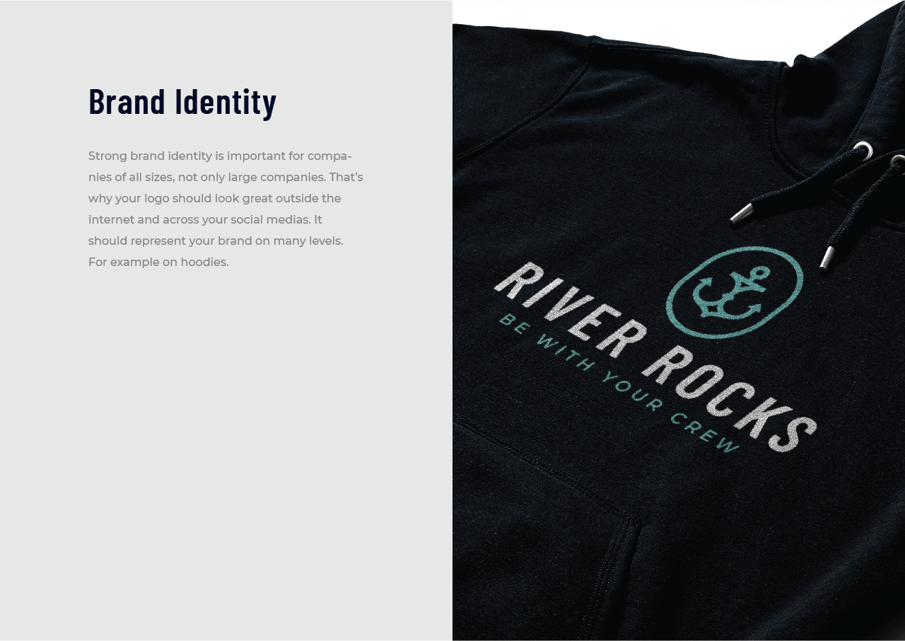
The River Rocks logo features a stylized anchor, a design element carefully chosen to embody the brand's connection to watersports and the lifestyle of water enthusiasts. The anchor symbolizes stability and a strong connection to maritime activities, making it an ideal representation for a brand focused on wakeboarding, waterskiing, and other water-based sports. In this logo, the anchor is stylized to offer a fresh, modern twist while maintaining its classic significance. This unique design captures the essence of both the thrill of watersports and the relaxed, communal aspect of life on the water.
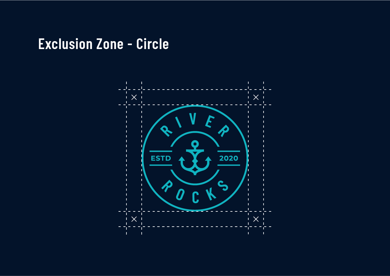
The color palette of navy and aqua was selected to enhance the logo's impact and align with the brand’s identity. Navy, a deep and rich shade of blue, evokes a sense of reliability, depth, and professionalism. It reflects the seriousness and dedication of the watersports community while providing a strong, classic anchor to the design. Aqua, a vibrant and refreshing blue-green color, represents the dynamic and energetic nature of water activities. It conveys a sense of freshness and vitality, aligning with the brand’s emphasis on trendiness and a laid-back, “hang loose” attitude.
In-Depth Project Description: A Exploration of the Narrative, Design Strategy and Implementation Approach
Project Overview
The River Rocks project involved designing a distinctive logo that resonates with the brand’s focus on watersports and the crew lifestyle associated with river and lake activities. The goal was to create a visual identity that captures the essence of the brand's target audience—water enthusiasts who are both trend-conscious and passionate about their sport. The final design features a stylized anchor, chosen to symbolize stability and a deep connection to maritime activities while presenting a fresh, modern twist. Complemented by a color palette of navy and aqua, the logo reflects the dynamic and cool nature of watersports, encapsulating the vibrant and laid-back spirit of the brand.
Client Expectation
The client sought a modern, geometric, and bold anchor logo that would stand out in the competitive watersports market. They envisioned a design that is not only striking but also aligns with the contemporary and trendy nature of their target audience. The logo needed to be geometric in form to ensure a clean and distinctive appearance, while the bold execution would capture attention and convey confidence. The aim was to create a visual identity that feels fresh and relevant to those who are passionate about watersports and the social aspects of life on the water.
My approach
To meet the client’s expectations, I approached the project by focusing on creating a geometric and bold stylized anchor that aligns with the modern aesthetic desired. I began by conceptualizing an anchor design that is both unique and visually striking, ensuring it stands out while remaining clean and geometric. The design was crafted to balance boldness with simplicity, making it memorable and impactful. I selected a color palette of navy and aqua to complement the design, using navy to convey reliability and professionalism, and aqua to add a vibrant, energetic touch. This combination ensures the logo is not only visually appealing but also effectively represents the brand’s dynamic and laid-back identity.