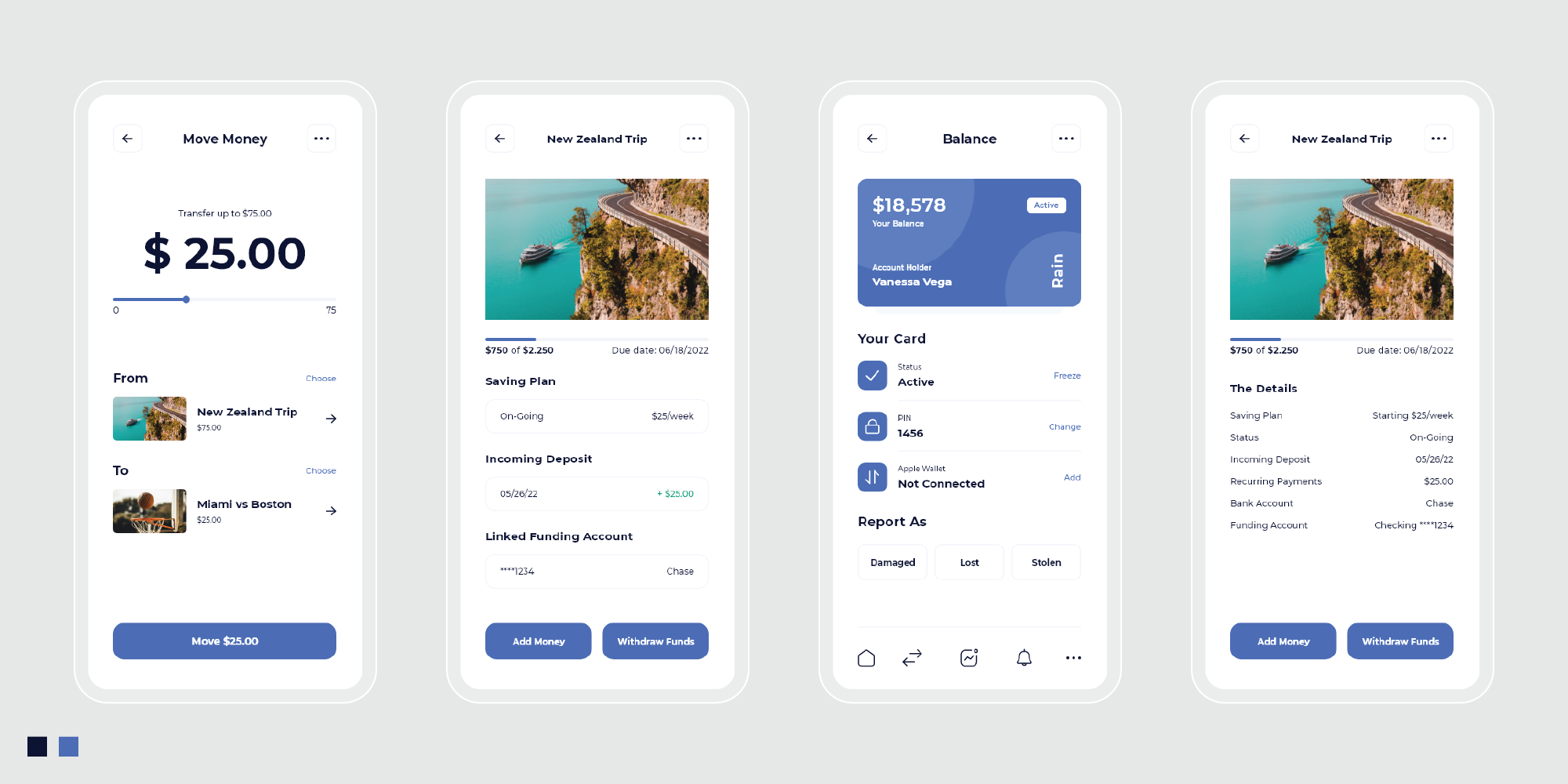
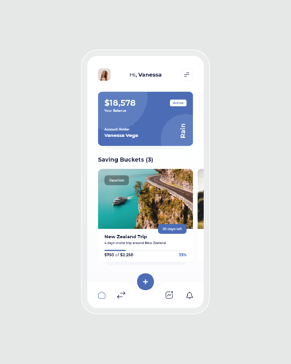
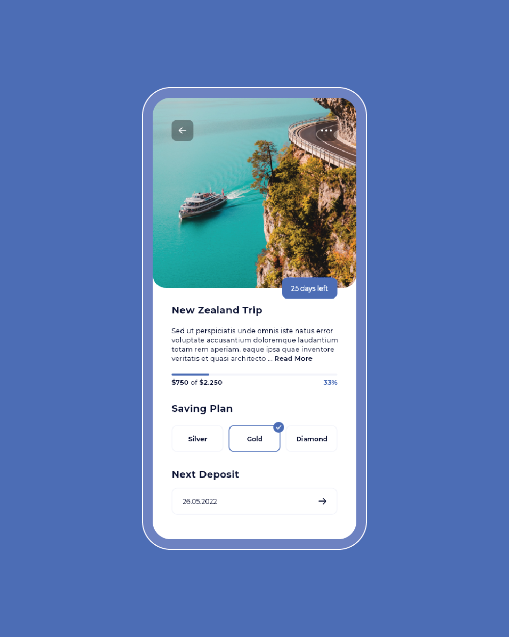
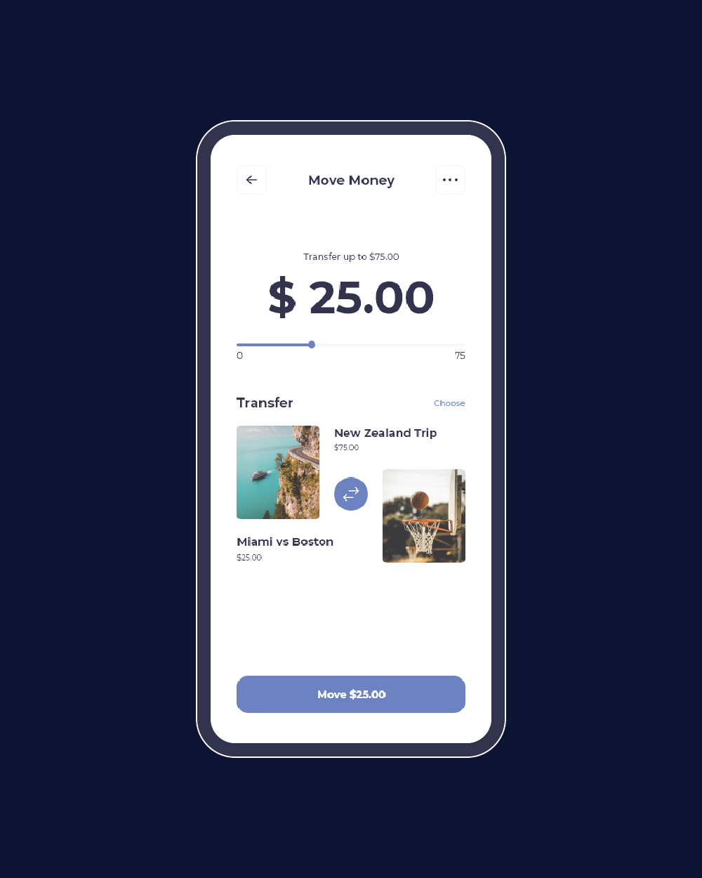
The app features a clean, minimalist layout to ensure that users can focus on their financial goals without being overwhelmed by unnecessary details. This approach helps in making the app intuitive and easy to navigate, reflecting Rain’s commitment to a smarter, more efficient banking experience. The design incorporates clear, distinct visual elements for saving buckets, allowing users to easily set up and track their financial goals. This feature is central to the app's functionality, and its straightforward presentation helps users stay organized and motivated.
The use of white creates a clean, uncluttered backdrop, promoting clarity and simplicity. It helps highlight key features and ensures the interface remains user-friendly. Navy is utilized to convey professionalism and trustworthiness, providing a sense of stability and reliability essential for a banking app. This deep color contrasts effectively with the white background, drawing attention to important elements. Light blue accents introduce vibrancy and energy, reinforcing a sense of financial trust and responsibility while guiding users through the app’s features.
