ShaneMVP - Website Designer & Developer
Movigo - Car Rental
Client: anqi.00
Date: July 2024
Category: Web Design + Development
Check out my:
A Detailed Look at the Project Journey: From Initial Vision Through Obstacles to Final Outcomes
Concept
Movigo needed a digital presence that mirrored its commitment to quality and customer satisfaction. My goal was to design a website that not only showcased their premium fleet but also provided a seamless and intuitive user experience. By focusing on modern aesthetics and functionality, I aimed to make car rentals easy and accessible for all users.
Challenge
The primary challenge was to develop a website that was both visually appealing and highly functional. I needed to ensure that the design was modern and attractive while maintaining intuitive navigation and ease of use. Additionally, the site had to be informative, providing all necessary details about rental options, insurance, and locations without overwhelming the user.
Solution
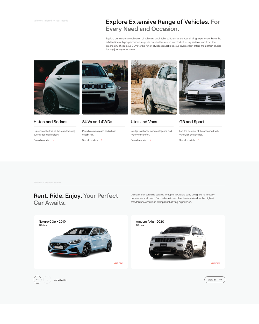
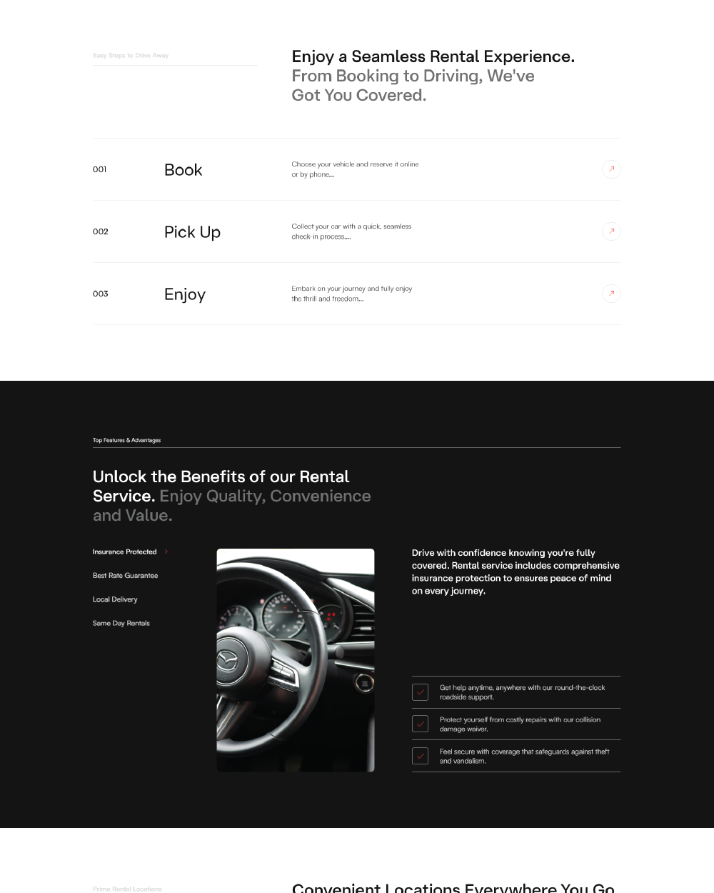
To address these challenges, I employed a clean, responsive design that adapts beautifully to all devices. I incorporated intuitive navigation menus, clear call-to-action buttons, and a straightforward booking process. Informative sections were strategically placed to guide users through the rental process, while high-quality visuals highlighted the range of vehicles.
Webpage Development
Delving into the Design: An Exploration of the Meaning Behind the Visual Elements and Creative Vision
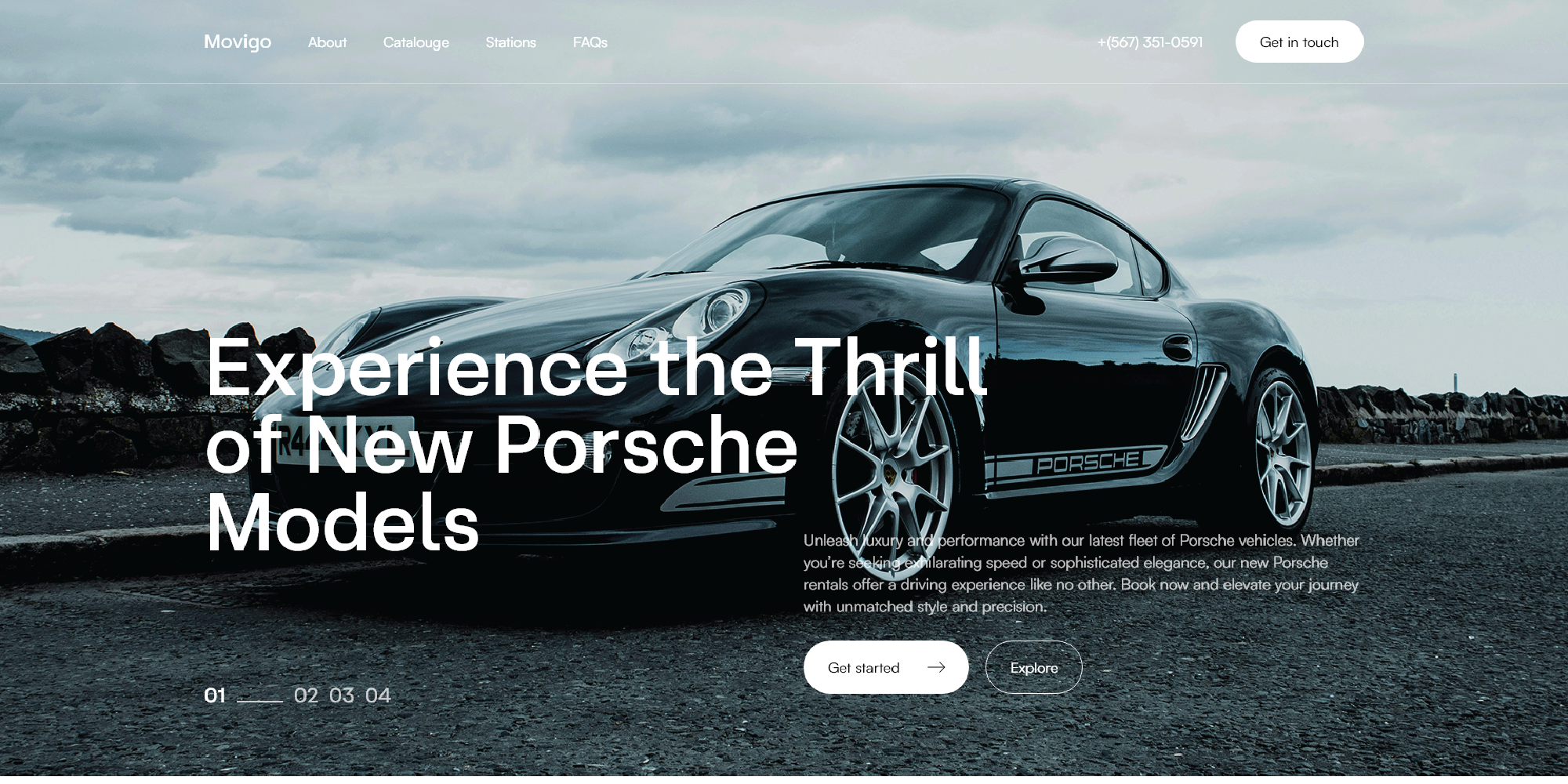
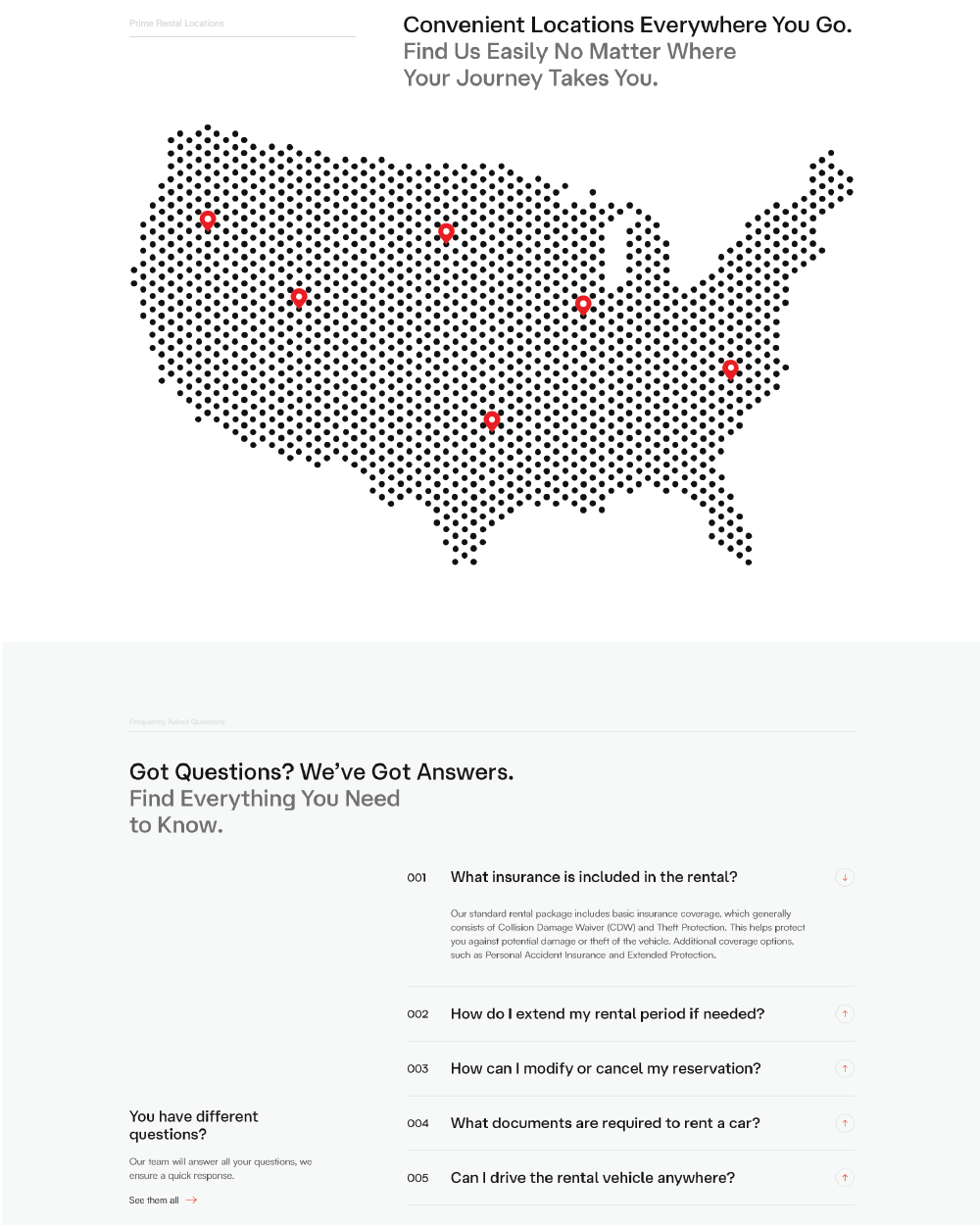
The design of Movigo’s website was crafted with a modern and luxurious aesthetic to reflect the premium nature of the brand. Eye-catching headings are employed to immediately draw users’ attention to key information and guide them through the site effortlessly. The color palette—comprising black, grey, and white—exudes sophistication and elegance, underscoring the luxury of Movigo’s car rental services. These colors provide a clean and timeless look, ensuring the site remains stylish and relevant.
A very small accent of red is used strategically to highlight important elements and calls to action, creating a visual hierarchy that enhances user navigation without overwhelming the overall design. This careful balance of modern design elements and a refined color scheme creates an engaging, intuitive, and visually appealing user experience, perfectly aligning with Movigo's brand identity.
In-Depth Project Description: A Exploration of the Narrative, Design Strategy and Implementation Approach
Project Overview
The Movigo project involved creating a sophisticated, user-friendly website that accurately represented the company’s premium car rental services. The goal was to design a platform that combined modern aesthetics with seamless functionality, providing users with an intuitive and engaging experience. Key elements included a responsive design, clear navigation, and informative sections about rental options, insurance coverage, and locations.
Client Expectation
The client expected a website that was both visually stunning and highly practical. They wanted a modern, elegant design that reflected the luxury of their brand, with eye-catching headings and a sleek color scheme. Additionally, the website needed to be informative yet easy to navigate, ensuring that users could quickly find and understand the information they needed to make rental decisions. The client also emphasized the importance of a straightforward booking process and mobile responsiveness.
My approach
My approach focused on balancing aesthetic appeal with seamless functionality. I chose a sophisticated color palette of black, grey, and white, with small accents of red to highlight important elements and calls to action. Eye-catching headings were designed to draw users’ attention to key information. The website layout was carefully structured to provide clear navigation and an intuitive user experience. By employing a responsive design, I ensured that the site looked and performed excellently on all devices. Informative sections were strategically placed to guide users through the rental process, culminating in a user-friendly and visually compelling platform that met all client expectations.