ShaneMVP - Website Designer & Developer
Melbourne Support
Client: Deon Botha
Date: December 2022
Category: Logotype
Check out my:
A Detailed Look at the Project Journey: From Initial Vision Through Obstacles to Final Outcomes
Concept
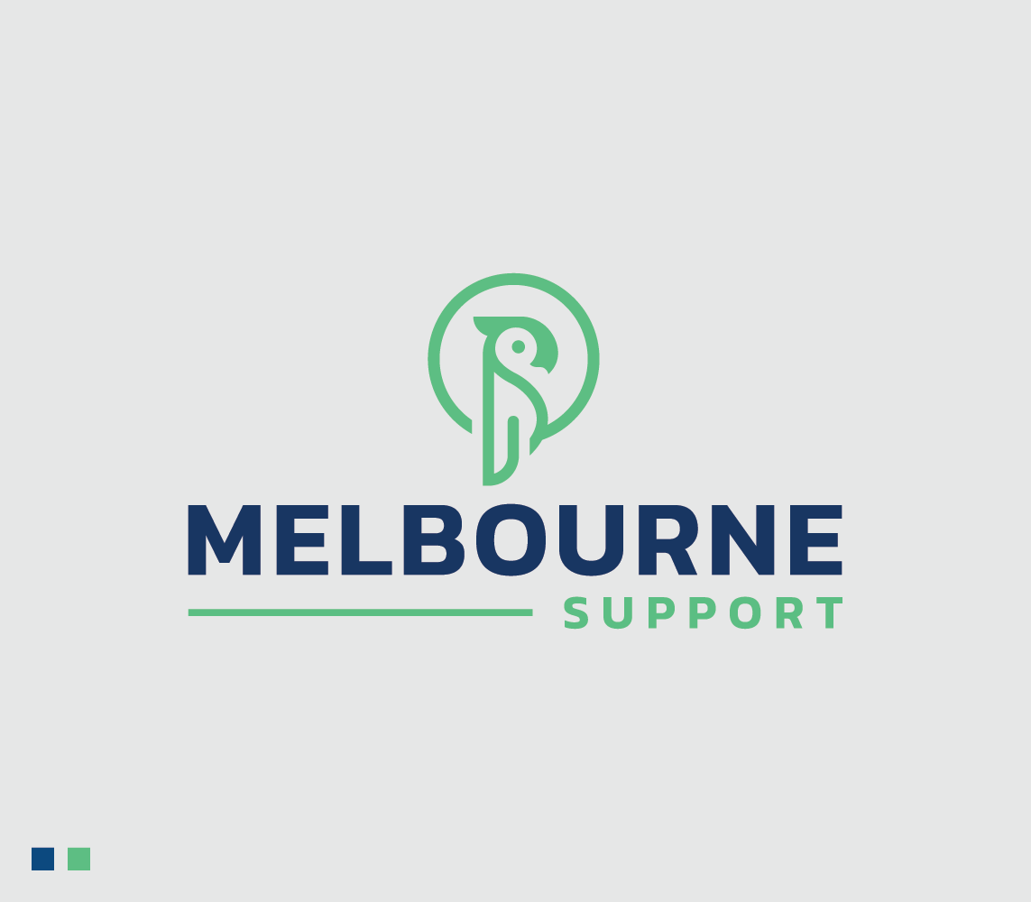
The concept for this logo revolves around capturing the vibrant and dynamic essence of Melbourne, reflecting its rich arts, culture, and coffee scene. The design features a parrot enclosed in a circle, rendered in a clean, modern line style. The parrot, a symbol of communication, adaptability, and vibrancy, aligns with the services provided by Melbourne Support. It signifies the organization's role in helping new residents navigate their relocation smoothly while embracing the lively and colorful lifestyle Melbourne has to offer. The circle around the parrot represents unity and inclusiveness, emphasizing the comprehensive support the company provides.
Challenge
The primary challenge was to create a logo that stands out in a market flooded with generic designs and stock iconography. It was crucial to develop a unique and memorable identity that resonates with a diverse demographic of 20 to 40-year-olds who are highly educated and upwardly mobile. The logo needed to reflect Melbourne's distinct appeal, encompassing its arts, culture, and coffee scene, while also conveying a sense of trust and professionalism. Additionally, the design had to be versatile enough to work across different platforms, including the main website and its regional sister site.
Solution
To address these challenges, the parrot was chosen as the central symbol for its connotations of communication and adaptability, key traits for anyone relocating. The circle surrounding the parrot not only adds a sense of unity but also ensures the logo is visually contained and versatile for various uses. By placing the company name beneath the logo, the design maintains a clean and professional appearance. This unique approach ensures that the logo is distinctive, memorable, and reflective of Melbourne’s vibrant lifestyle, effectively communicating the company's mission to support and guide new residents in their transition.
Webpage Development
Webpage Development
Webpage Development
Delving into the Design: An Exploration of the Meaning Behind the Visual Elements and Creative Vision
The visual elements of the logo are thoughtfully designed to capture the essence of Melbourne and the unique services offered by Melbourne Support. The parrot, as the central symbol, embodies communication, adaptability, and vibrancy. In the context of the relocation service, the parrot represents the company's role in guiding new residents through their move with ease and enthusiasm. Known for its colorful plumage and lively nature, the parrot mirrors Melbourne’s dynamic arts and culture scene, as well as its vibrant coffee culture. The circular enclosure around the parrot signifies unity and a comprehensive approach to relocation support, emphasizing the company's commitment to providing a well-rounded and inclusive service.
The color palette of green and navy was chosen to enhance the logo’s impact and relevance. Green symbolizes growth, renewal, and vitality, reflecting the fresh start and exciting opportunities that come with relocating to a new city. It also connects to Melbourne’s lush parks and outdoor spaces, underscoring the city’s welcoming and vibrant atmosphere. Navy, on the other hand, conveys professionalism, trust, and stability. It adds a sense of sophistication and reliability to the logo, ensuring that the brand is perceived as a dependable and knowledgeable partner in the relocation process. Together, these colors create a harmonious balance, reinforcing the logo’s modern and unique character while aligning with the dynamic lifestyle and cultural richness of Melbourne.
In-Depth Project Description: A Exploration of the Narrative, Design Strategy and Implementation Approach
Project Overview
This project involved designing a logo for Melbourne Support, a company that assists individuals relocating to Melbourne, Australia, whether from abroad or interstate. The goal was to create a unique and engaging logo that reflects the vibrant and dynamic nature of Melbourne while effectively communicating the company's role in providing comprehensive relocation support. The design needed to stand out from generic options and resonate with a youthful, upwardly mobile audience.
Client Expectation
The client sought a youthful and modern logo that would appeal to individuals in their 20s to 40s. The design needed to be fresh, unique, and distinct from common stock iconography and fonts that have been overused in the industry. The logo should capture the essence of Melbourne’s vibrant lifestyle and cultural richness while maintaining a professional appearance suitable for various applications, including digital platforms and printed materials.
My approach
To meet the client's expectations, I designed a logo featuring a parrot enclosed in a circle, rendered in a sleek line style. The parrot symbolizes communication and adaptability, key traits for a relocation service, and aligns with Melbourne’s colorful and lively atmosphere. The use of green and navy colors was chosen to convey growth, vitality, and professionalism. The circle around the parrot adds a sense of unity and completeness, ensuring the logo is versatile and impactful across different mediums. This approach resulted in a modern, youthful logo that stands out from the competition and effectively represents Melbourne Support's mission and values.