ShaneMVP - Website Designer & Developer
Massachusetts - Patient Advocacy Alliance
Client: michaeCV
Date: January 2023
Category: Logotype
Check out my:
A Detailed Look at the Project Journey: From Initial Vision Through Obstacles to Final Outcomes
Concept
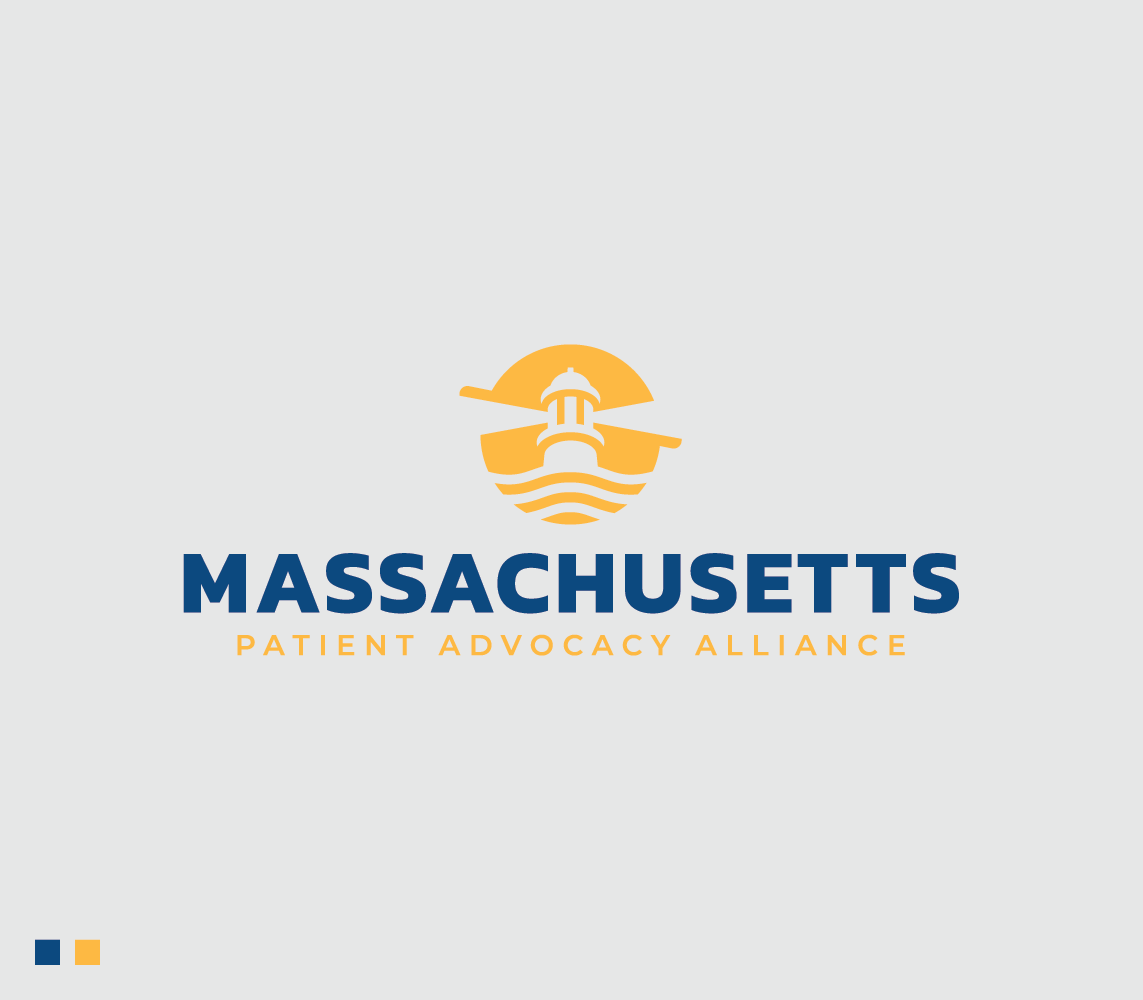
The concept for this logo redesign centers around modernizing the existing lighthouse symbol while preserving its historical significance and recognizability. The lighthouse, a longstanding emblem of guidance and safety, remains the focal point, symbolizing the organization's commitment to advocacy and support in the medical marijuana field. The updated design features a sleek, contemporary lighthouse within a circle, emitting beams of light to signify hope and direction. Waves at the base of the lighthouse emphasize the organization’s stability and resilience, grounding the design in a sense of reliability and trust.
Challenge
The primary challenge was to create a refreshed logo that maintains the essence of the original lighthouse design while introducing a modern, professional aesthetic. The logo needed to be versatile enough to be effectively used across various platforms, including the website, social media, and official letterheads. Additionally, given the organization's long name, the icon itself had to be distinctive and recognizable, ensuring clear identification without the need for the full name. It was also crucial to design an emblem that looks official and appropriate for communication with state agencies and government officials, while avoiding any association with cannabis leaves or overly casual imagery.
Solution
To address these challenges, the lighthouse was redesigned with a contemporary look, featuring clean lines and a minimalist approach that aligns with modern design principles. The circle encompassing the lighthouse not only adds a sense of unity and completeness but also enhances the logo's recognizability. Beams of light radiate from the lighthouse, symbolizing guidance and enlightenment, while waves at the base provide a visual anchor, conveying stability and trustworthiness. This solution ensures the logo is both modern and official, suitable for diverse applications and resonating with a broad audience.
Webpage Development
Webpage Development
Webpage Development
Delving into the Design: An Exploration of the Meaning Behind the Visual Elements and Creative Vision
The visual elements of the redesigned logo thoughtfully encapsulate the core values and mission of the medical marijuana advocacy organization. The lighthouse, a central symbol in the logo, represents guidance, safety, and hope. Historically, lighthouses have served as beacons of light, guiding ships through treacherous waters to safe harbors. In the context of the organization, the lighthouse signifies its role in providing direction, support, and advocacy for patients navigating the complexities of medical marijuana use. The beams of light emanating from the lighthouse highlight the organization’s mission to enlighten and inform, spreading awareness and fostering understanding. The waves at the base of the lighthouse anchor the design, symbolizing stability, resilience, and a strong foundation in advocacy work.
The color palette of yellow and deep rich blue further enhances the logo’s meaning and visual impact. Yellow, often associated with positivity, energy, and clarity, symbolizes the organization's commitment to bringing light and hope to the lives of those it serves. It reflects the proactive and optimistic approach the organization takes in its advocacy efforts, aiming to create a brighter future for medical marijuana patients. Deep rich blue, on the other hand, conveys professionalism, trust, and reliability. Blue is a color that often evokes feelings of calm and stability, aligning with the organization’s goal to provide a steady and dependable source of support and information. The combination of yellow and deep rich blue creates a harmonious balance, representing both the dynamic and trustworthy nature of the organization.
In-Depth Project Description: A Exploration of the Narrative, Design Strategy and Implementation Approach
Project Overview
This project involved redesigning the logo for a medical marijuana advocacy organization that has used a lighthouse symbol since its inception. The goal was to create a modern, professional logo that retains the essence of the original design while enhancing its appeal and functionality across various platforms. The new logo needed to be suitable for use on the organization’s website, social media, and official communications with government agencies, ensuring it conveys a sense of maturity, sophistication, and modernity.
Client Expectation
The client sought a very modern, mature, and sophisticated logo that would stand out and be easily recognizable without relying on the full name of the organization. The logo had to maintain a professional appearance suitable for communication with state agencies and government officials. It was essential to avoid any imagery associated with cannabis leaves, ensuring the logo reflected the serious and official nature of the organization’s advocacy work.
My approach
To meet the client's expectations, I focused on creating a sleek, contemporary design that honors the traditional lighthouse symbol while updating it for modern use. The lighthouse was refined with clean lines and a minimalist style to convey sophistication and maturity. I incorporated beams of light and waves at the base to symbolize guidance, hope, stability, and resilience. The color palette of deep rich blue and yellow was chosen to evoke professionalism, trust, and positivity, ensuring the logo stands out while maintaining an official and mature look.