ShaneMVP - Website Designer & Developer
Isleno Retreat
Client: islenoR
Date: November 2023
Category: Logotype
Check out my:
A Detailed Look at the Project Journey: From Initial Vision Through Obstacles to Final Outcomes
Concept
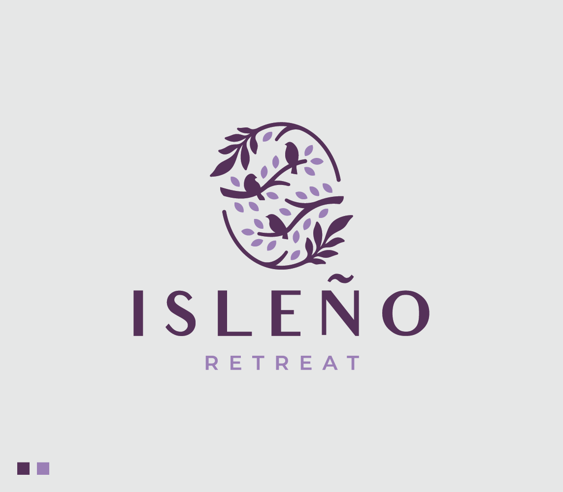
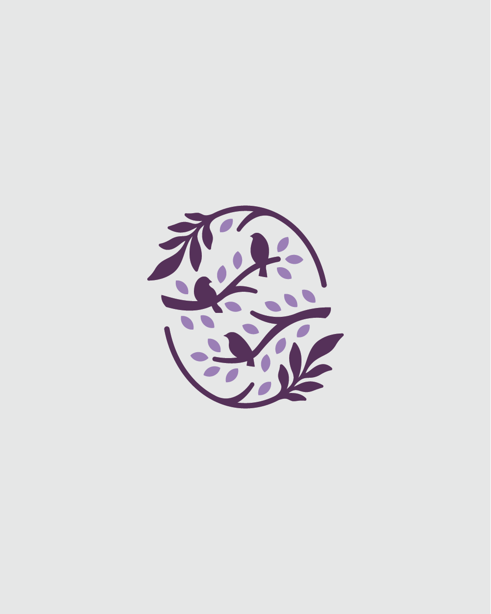
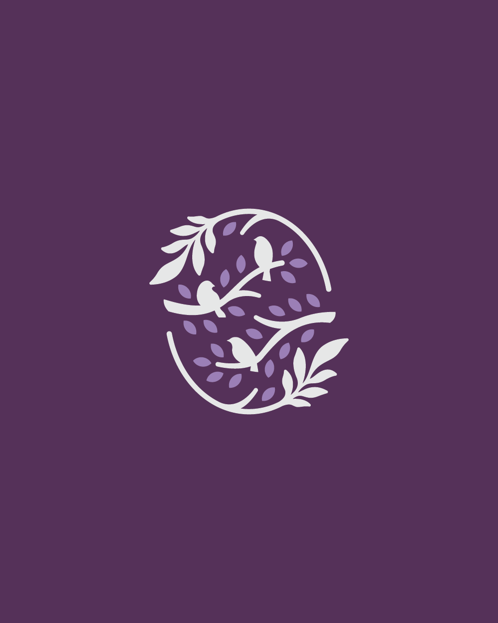
The Isleno Retreat logo is designed to encapsulate the essence of a cozy rented cottage nestled within a serene forest. The focal point of the design is an oval shape that frames three birds sitting on branches adorned with leaves. These elements symbolize harmony with nature, tranquility, and the simple beauty of the retreat's surroundings. The birds represent a sense of community and connection to the natural world, while the leaves emphasize growth and renewal. This thoughtful design aims to evoke feelings of peace, relaxation, and a deep connection to the forest environment, perfectly capturing the spirit of Isleno Retreat.
Challenge
The primary challenge in creating the Isleno Retreat logo was to visually convey the tranquil and inviting atmosphere of the cottage while ensuring it stands out in a competitive market. The design needed to be both distinctive and evocative, appealing to potential guests looking for a serene forest getaway. It was crucial to balance simplicity and elegance with meaningful symbolism, ensuring the logo effectively communicates the retreat's essence without becoming overly complex or cluttered. Additionally, the logo had to be versatile enough to be used across various mediums, from digital platforms to printed materials.
Solution
To address this challenge, we developed a logo that combines simplicity with symbolic depth. The oval shape of the design adds a sense of warmth and coziness, while framing the core elements of the logo. The three birds perched on branches with leaves communicate a sense of harmony and connection with nature. This imagery effectively reflects the retreat’s serene environment and its focus on providing a peaceful escape. The clean lines and balanced composition ensure the logo is easily recognizable and memorable, enhancing its appeal across different formats and applications. This design solution successfully captures the inviting spirit of Isleno Retreat.
Webpage Development
Webpage Development
Webpage Development
Delving into the Design: An Exploration of the Meaning Behind the Visual Elements and Creative Vision
The design of the Isleno Retreat logo is rich with symbolism that reflects the essence of a cozy, nature-centric getaway. The oval shape is chosen for its warm and embracing connotations, mirroring the welcoming and intimate atmosphere of the cottage. Within this shape, three birds sitting on branches with leaves are depicted. The birds symbolize harmony, community, and a deep connection to the natural world, evoking the serene and peaceful environment of the retreat. The branches and leaves further emphasize the retreat's close relationship with nature, highlighting themes of growth, renewal, and the simple beauty of the forest setting.
The choice of colors plays a crucial role in reinforcing the visual identity and emotional appeal of the Isleno Retreat logo. The use of purple and dark purple adds a layer of sophistication and tranquility to the design. Purple is often associated with calmness, luxury, and a sense of mystique, which aligns perfectly with the retreat's aim to provide a unique and restful experience in a natural setting. The darker shades of purple bring depth and richness, enhancing the overall elegance of the logo while maintaining a sense of coziness and comfort.
In-Depth Project Description: A Exploration of the Narrative, Design Strategy and Implementation Approach
Project Overview
The Isleno Retreat logo project focused on creating a visual identity that embodies the serene and inviting nature of a cozy cottage nestled in the forest. The goal was to design a logo that effectively communicates the retreat's tranquil environment and its harmonious connection with nature. Through thoughtful symbolism and careful color selection, the logo aims to evoke feelings of peace, relaxation, and community, making it instantly recognizable and memorable.
Client Expectation
The client sought a logo that was modern, cozy, and inviting, capturing the essence of Isleno Retreat. They wanted a design that would stand out in the competitive market, appealing to potential guests looking for a peaceful forest getaway. The logo needed to balance simplicity and elegance, ensuring it was both visually appealing and meaningful. Additionally, the client desired a versatile design that could be used across various mediums, from digital platforms to printed materials, while maintaining its charm and effectiveness.
My approach
To meet the client's expectations, I adopted a design approach that emphasizes simplicity, elegance, and meaningful symbolism. The oval shape of the logo adds a sense of warmth and coziness, while framing the central elements. The three birds perched on branches with leaves symbolize harmony, community, and a connection with nature, reflecting the retreat's serene environment. The use of purple and dark purple colors adds sophistication and tranquility, enhancing the overall inviting feel of the logo. By focusing on clean lines and balanced composition, I created a logo that is both distinctive and versatile, capturing the essence of Isleno Retreat and appealing to those seeking a tranquil nature escape.