ShaneMVP - Website Designer & Developer
Evolution Training
Client: evotrait
Date: March 2023
Category: Logotype
Check out my:
A Detailed Look at the Project Journey: From Initial Vision Through Obstacles to Final Outcomes
Concept
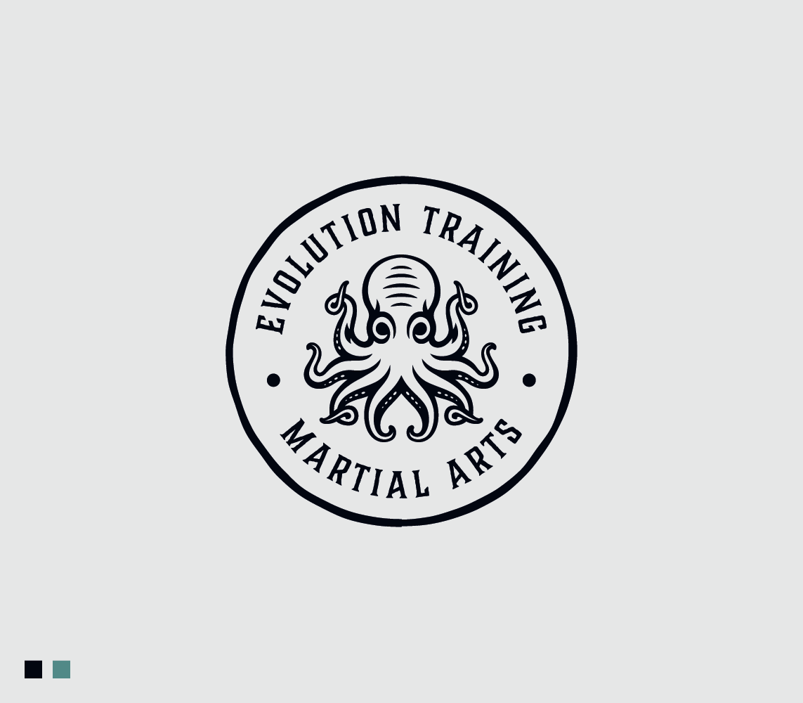
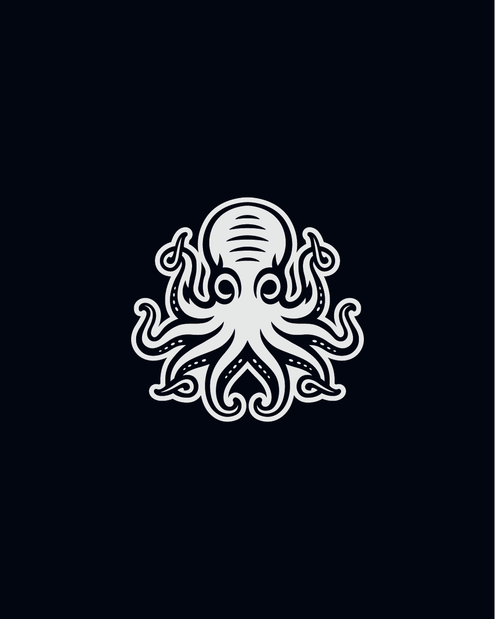
The concept for this logo and brand identity project is centered around the essence of the martial arts academy and its core values. The chosen design features an octopus encircled, symbolizing the academy's emphasis on flexibility, adaptability, and strategic thinking—qualities essential in martial arts. The octopus, as the academy's spirit animal, represents the mastery of technique, intelligence, and the ability to navigate any challenge. This visual identity not only reflects the academy’s focus on grappling but also conveys a sense of community and continuous personal growth.
Challenge
The main challenge was to create a logo that embodies the traditional and professional nature of the martial arts academy while also highlighting its fun, family-friendly atmosphere. It was crucial to design an emblem that appeals to both serious martial artists and families looking for a supportive and engaging environment. Additionally, the logo needed to capture the unique qualities of the octopus, such as flexibility, intelligence, and adaptability, in a way that resonates with the academy’s philosophy and teaching approach.
Solution
To address these challenges, the logo was meticulously designed to feature an octopus within a circle, signifying the comprehensive and inclusive nature of the academy’s training programs. The octopus was chosen for its symbolic representation of flexibility and strategic prowess, aligning with the academy’s grappling specialization. The circular shape reinforces the sense of unity and community, central to the academy’s environment. The design integrates elements that highlight both the traditional and dynamic aspects of martial arts, creating a balanced and appealing logo.
Webpage Development
Webpage Development
Webpage Development
Delving into the Design: An Exploration of the Meaning Behind the Visual Elements and Creative Vision
The logo design intricately reflects the core values and philosophy of the martial arts academy through its visual elements. The octopus, strategically placed within a circle, serves as the central symbol, representing flexibility, intelligence, and adaptability. These attributes are essential in martial arts, particularly in grappling, where superior technique and strategic control are paramount. The octopus, known for its ability to adapt to any situation and its mastery of camouflage, mirrors the academy's emphasis on continuous learning and personal growth. The circle encircling the octopus symbolizes unity, inclusiveness, and the holistic nature of the academy's training programs.
The color palette of navy and aqua further enhances the logo’s meaning and visual appeal. Navy, a color often associated with professionalism, strength, and reliability, underscores the academy’s commitment to providing top-notch instruction in a traditional martial arts setting. It conveys a sense of trust and authority, reassuring students and their families of the academy’s expertise. Aqua, on the other hand, introduces a fresh, vibrant element to the design. It symbolizes adaptability, creativity, and a welcoming atmosphere, aligning with the academy’s goal of fostering a fun, social, and family-friendly environment.
In-Depth Project Description: A Exploration of the Narrative, Design Strategy and Implementation Approach
Project Overview
This project involved designing a logo and brand identity for a traditional martial arts academy specializing in Brazilian Jiu-Jitsu (BJJ), kickboxing, and self-defense. The academy provides professional instruction within a social and family-oriented environment, with a strong focus on grappling techniques. The aim was to create a logo that encapsulates the academy’s core values of flexibility, adaptability, and strategic thinking, represented by the octopus as a spirit animal.
Client Expectation
The client desired a masculine and luxurious logo that also features highly legible text. The logo needed to convey strength, professionalism, and sophistication, aligning with the academy’s traditional roots and high standards of instruction. Additionally, the text had to be clear and easy to read, ensuring that the academy’s name is immediately recognizable and memorable.
My approach
To meet the client's expectations, I focused on creating a powerful and refined logo that balances traditional elements with modern design aesthetics. The octopus, symbolizing flexibility and strategic prowess, was placed within a circle to represent unity and comprehensive training. For the color scheme, I chose navy and aqua to convey professionalism, reliability, and a welcoming atmosphere. Navy adds a sense of strength and authority, while aqua introduces a vibrant and adaptable element, reflecting the academy's dynamic and inclusive environment.