ShaneMVP - Website Designer & Developer
Epic Ideas
Client: David.wise
Date: November 2021
Category: Logotype + Brand Guidelines
Check out my:
A Detailed Look at the Project Journey: From Initial Vision Through Obstacles to Final Outcomes
Concept
For the Epic Ideas project, my concept centers around illuminating business potential with creative design. As a graphic designer, I’ve crafted a logo featuring a lightbulb with an upward arrow to symbolize fresh perspectives and growth. This design reflects the core mission of Epic Ideas: to offer businesses new insights and strategies that elevate their brand and operations. My goal was to visually represent the concept of innovation and upward momentum, embodying the transformative impact of a new perspective. The lightbulb represents the idea of discovery and illumination, while the arrow signifies progress and advancement, setting the stage for businesses to reach new heights.
Challenge
Businesses often grapple with stagnation and missed opportunities due to outdated practices or a lack of fresh ideas. The challenge lies in identifying these areas where transformation is needed and overcoming the inertia that can hold businesses back. Many companies struggle with ineffective branding, outdated advertising strategies, or inefficient systems that hinder growth. As a freelancer working on this project, I faced the task of visually conveying these challenges through the logo design. My goal was to capture the essence of overcoming stagnation and unlocking new growth potential, ensuring that the visual elements effectively communicate the idea of breaking free from conventional limitations and embracing new opportunities.
Solution
The solution I provided is a thoughtfully designed logo that serves as a visual catalyst for business transformation. By incorporating a lightbulb with an upward arrow, I created a symbol that embodies innovation and progress. This design is intended to inspire and reflect the essence of what Epic Ideas offers—fresh perspectives and strategic growth. The logo is crafted to align with the client's vision of helping businesses enhance their branding, advertising, profitability, systems, and culture. It not only represents the idea of illumination and advancement but also serves as a strategic tool to communicate the transformative impact that Epic Ideas brings to its clients. My design aims to visually encapsulate the process of moving from stagnation to success, offering a compelling representation of their mission and services.
Webpage Development
Webpage Development
Webpage Development
Webpage Development
Webpage Development
Delving into the Design: An Exploration of the Meaning Behind the Visual Elements and Creative Vision
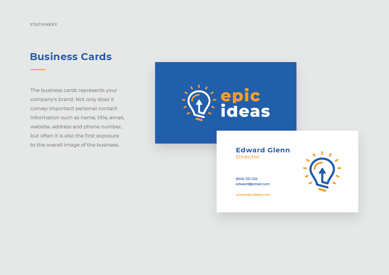
The Epic Ideas logo features a lightbulb with an upward arrow inside, a design that captures the essence of the brand’s mission. The lightbulb symbolizes illumination, innovation, and the generation of new ideas, reflecting Epic Ideas’ commitment to providing fresh perspectives and insights. It represents the act of shedding light on new opportunities, suggesting that the company helps businesses see things from a new, beneficial angle. The upward arrow within the lightbulb signifies growth, progress, and forward movement. It emphasizes the goal of elevating businesses to new heights by identifying and implementing transformative changes, reinforcing the idea of achieving greater success and profitability.
The color palette of yellow and blue was chosen for its psychological impact and alignment with the brand’s values. Yellow represents creativity, energy, and optimism, evoking feelings of warmth and positivity. This color captures attention and stimulates mental activity, aligning with the innovative and dynamic nature of Epic Ideas. It also reinforces the ‘light’ aspect of the lightbulb, symbolizing illumination and clarity. Blue, on the other hand, conveys trust, professionalism, and reliability. It promotes a sense of calm and stability, which is crucial for a brand that guides clients through transformative changes.
In-Depth Project Description: A Exploration of the Narrative, Design Strategy and Implementation Approach
Project Overview
The Epic Ideas project involved creating a distinctive logo that embodies the brand’s mission of providing transformative business insights. As a graphic designer, I was tasked with designing a visual identity that reflects the core values of innovation, growth, and clarity. The final logo features a lightbulb with an upward arrow inside, symbolizing the illumination of new ideas and the upward momentum of business growth. This design serves as a visual representation of the brand’s commitment to offering fresh perspectives and strategic solutions to its clients. The color palette of yellow and blue further enhances the logo’s impact, with yellow representing creativity and optimism, and blue conveying trust and professionalism.
Client Expectation
The client’s expectation was for a modern and bold logo that stands out in the marketplace and effectively communicates the brand’s innovative approach. They envisioned a design that is not only visually striking but also reflective of their mission to offer transformative business insights. The logo needed to be modern to resonate with contemporary audiences and bold to capture attention and convey confidence. The design should embody the essence of Epic Ideas—illuminating new opportunities and driving business growth—while also standing out in a competitive landscape.
My approach
In addressing the client’s expectations, my approach focused on creating a logo that is both visually compelling and conceptually aligned with the brand’s mission. I began by conceptualizing a design that integrates a lightbulb with an upward arrow, symbolizing innovation and progress. This choice of imagery was intended to visually represent the act of bringing new ideas to light and driving business growth. To enhance the design’s impact, I selected a color palette of yellow and blue. Yellow was chosen for its association with creativity and optimism, while blue was selected for its connotations of trust and professionalism. This combination aimed to create a logo that is modern and bold, yet grounded in the core values of the brand.