ShaneMVP - Website Designer & Developer
Ditra - Travel Agency
Client: crissps
Date: April 2024
Category: Web Design + Development
Check out my:
A Detailed Look at the Project Journey: From Initial Vision Through Obstacles to Final Outcomes
Concept
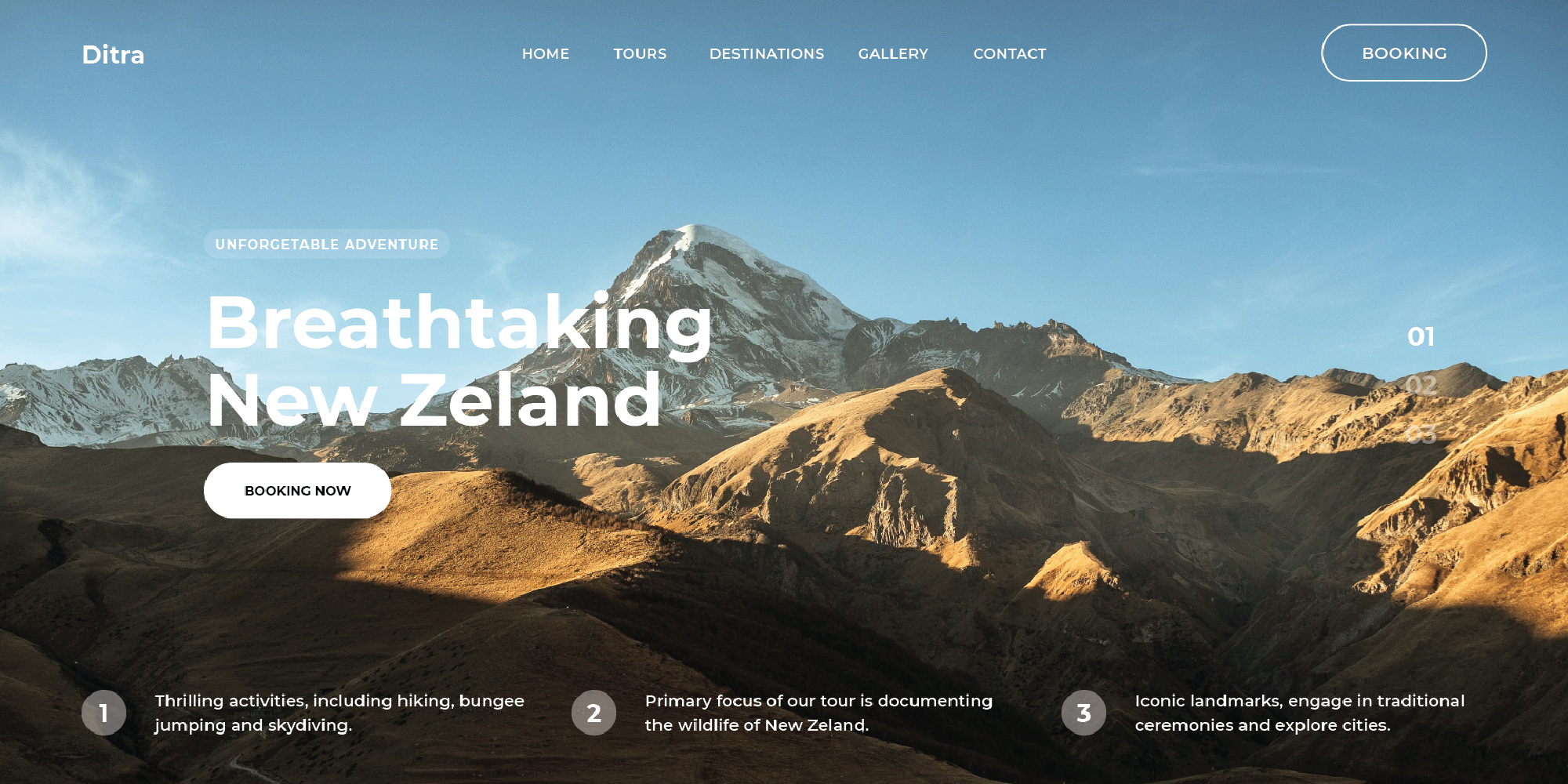
The concept for the travel agency website centers on creating a sleek, modern, and user-friendly platform that enhances the travel planning experience. The design aims to provide a clean and visually appealing interface that allows users to effortlessly explore and book their dream vacations. By focusing on simplicity and elegance, the website presents travel options and services in a way that is both engaging and easy to navigate, ensuring a seamless user experience from start to finish.
Challenge
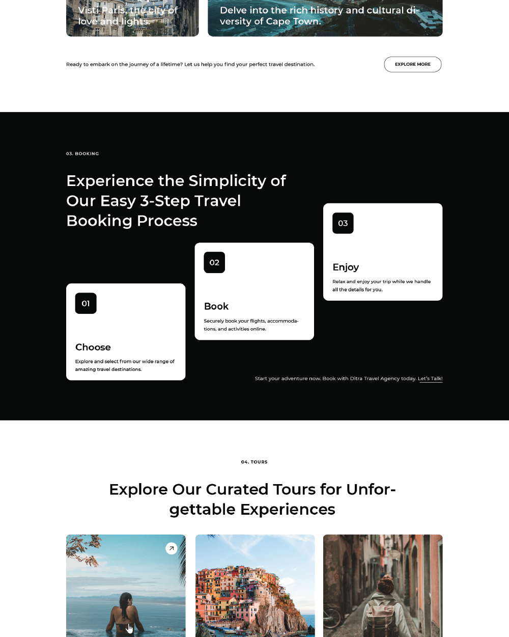
The primary challenge was to develop a website that not only captures the essence of modern design but also meets the functional needs of travelers. The site needed to balance aesthetic appeal with practical features, such as detailed travel information, intuitive navigation, and efficient booking processes. Creating an engaging yet straightforward design that accommodates a diverse range of travel services and destinations, while also maintaining an attractive and clean look, required a thoughtful approach to both layout and content presentation.
Solution
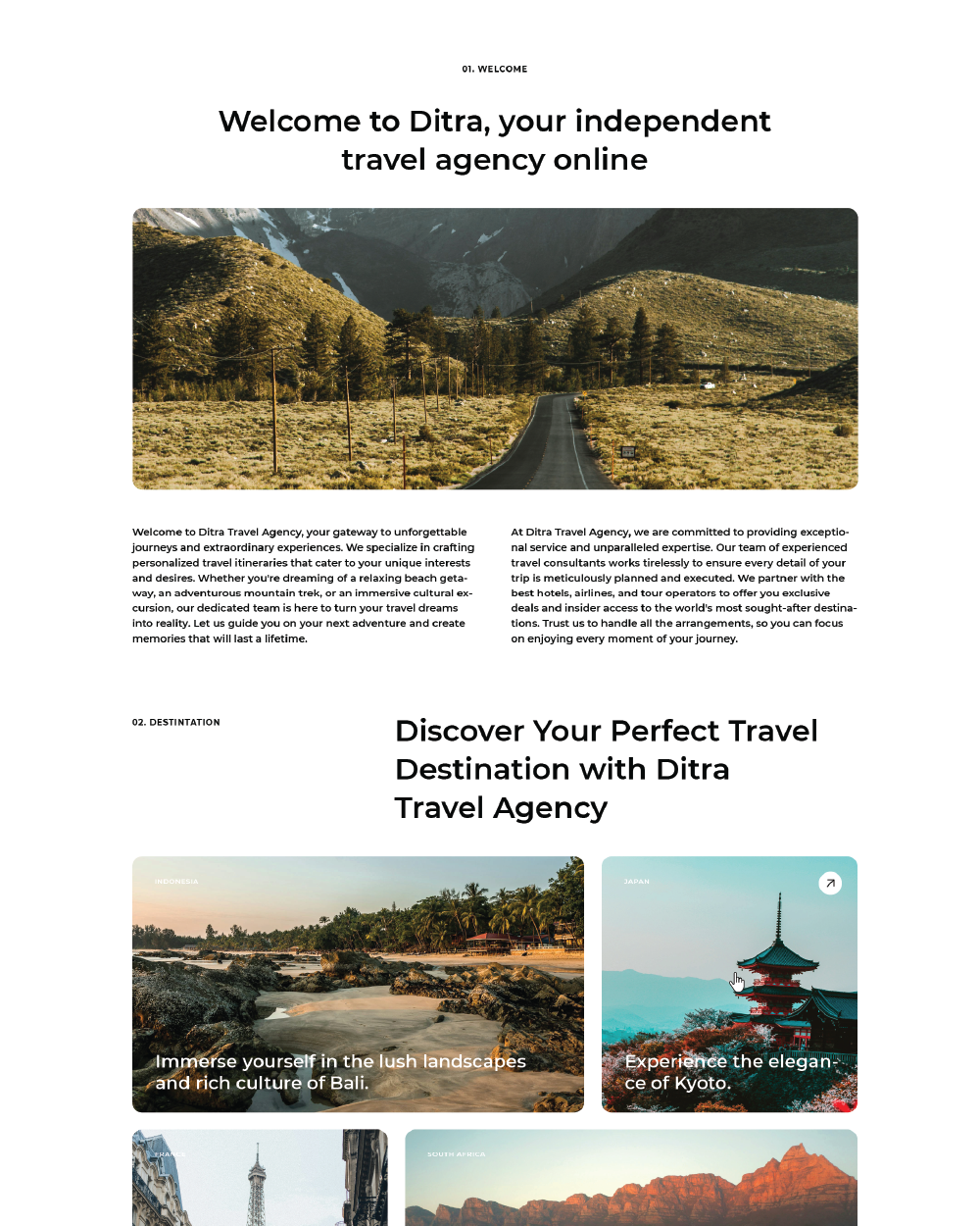
To address these challenges, the website was crafted with a focus on user experience and visual appeal. A minimalist layout was employed to ensure that the interface remains uncluttered and easy to navigate. High-resolution images and engaging content highlight the unique aspects of each travel offering, while strategic placement of calls to action guides users towards booking their trips effortlessly. Responsive design ensures that the website performs well on all devices, providing a consistent and enjoyable experience whether users are browsing on a desktop, tablet, or smartphone.
Webpage Development
Delving into the Design: An Exploration of the Meaning Behind the Visual Elements and Creative Vision
The design of the travel agency website embodies a modern and sophisticated aesthetic, crafted to enhance user experience and engagement. The style is characterized by clean lines, ample white space, and a minimalist approach that ensures a clutter-free interface. This contemporary design is intended to evoke a sense of clarity and ease, making travel planning both enjoyable and straightforward. The website features a sleek, modern style with a focus on simplicity and functionality. High-quality images and subtle color palettes highlight the beauty and allure of travel destinations, while maintaining a clean and professional look. The use of intuitive navigation and clear visual hierarchies ensures that users can easily access and explore various travel options without feeling overwhelmed.
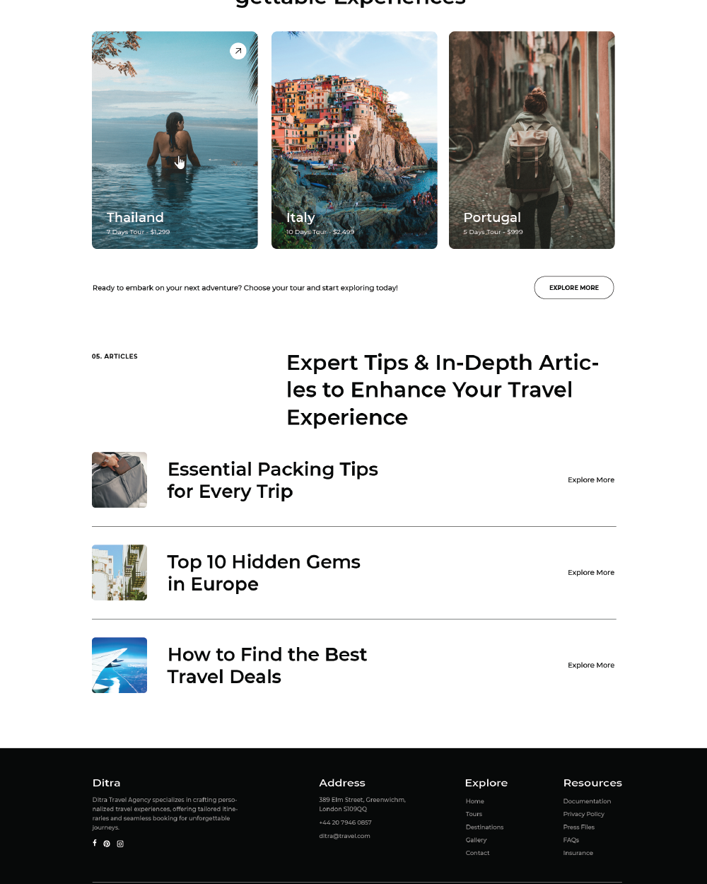
A key element of the website’s design is its typography, which significantly contributes to its modern and clean aesthetic. The website employs a sans-serif font, chosen for its crisp, streamlined appearance and high legibility. Sans-serif fonts are known for their simplicity and readability, which helps maintain a polished and professional look throughout the site. This font choice ensures that all textual content is easy to read on various devices, from desktops to mobile screens. The use of this modern font not only enhances readability but also aligns with the overall design philosophy of minimalism and sophistication. It supports the clean, uncluttered appearance of the website, making information more accessible and engaging. The font’s versatility allows it to adapt seamlessly to different text sizes and weights, ensuring consistency and clarity across headings, body text, and calls to action.
In-Depth Project Description: A Exploration of the Narrative, Design Strategy and Implementation Approach
Project Overview
The project involved designing a modern and user-friendly website for a travel agency. The goal was to create a clean, visually appealing platform that simplifies travel planning and enhances the user experience. The website features a minimalist design, intuitive navigation, and high-quality visuals to showcase various travel destinations and services. The result is a streamlined and efficient site that effectively engages users and facilitates seamless booking processes.
Client Expectation
The client sought a website that embodies a clean and modern aesthetic while prioritizing high functionality. The site needed to be fast-loading and lightweight, ensuring quick access and responsiveness across all devices. The design should offer a highly functional user experience, integrating easy navigation with a visually engaging interface. The objective was to create a platform that not only looks contemporary but also performs efficiently, meeting the needs of users seeking a seamless and enjoyable travel planning experience.
My approach
To meet the client's expectations, I focused on crafting a website that balances aesthetic appeal with optimal functionality. The design emphasizes a clean and modern look, achieved through the use of minimalistic elements and a streamlined layout. A sans-serif font was chosen for its readability and contemporary feel, contributing to the site’s overall clarity and ease of use. I prioritized performance by optimizing images and employing efficient coding practices to ensure the website loads quickly and operates smoothly.