ShaneMVP - Website Designer & Developer
Day To Day - Bookkepeers
Client: lornsj
Date: October 2020
Category: Logotype + Brand Guidelines
Check out my:
A Detailed Look at the Project Journey: From Initial Vision Through Obstacles to Final Outcomes
Concept
The concept for the Day To Day Bookkeepers logo revolves around symbolizing growth, reliability, and trust, which are core values for a bookkeeping and payroll service. The logo features a lightbulb combined with an upward sloping line, representing ideas, innovation, and financial growth. The lightbulb signifies insight and clarity, essential qualities for a company that manages intricate financial details. The upward sloping line illustrates progress and growth, aligning with the client’s mission to help businesses, contractors, and home service professionals thrive. This design conveys the company’s role in providing comprehensive and reliable bookkeeping solutions, fostering trust and supporting business success.
Challenge
The primary challenge was to design a logo that effectively communicates the essence of daily bookkeeping and payroll services while resonating with business owners, contractors, and home service professionals. The logo needed to visually convey growth and trust in a way that is both professional and engaging. Incorporating IBM blue as the dominant color added a layer of complexity, as it had to be balanced with other design elements to ensure a modern and impactful appearance. Additionally, the logo had to be versatile enough for various applications, from digital platforms to print materials, and clearly represent the company's focus on reliability and financial management.
Solution
To address these challenges, I designed a logo featuring a lightbulb with an upward sloping line. The lightbulb symbolizes innovation, clarity, and insight, which are key attributes for a bookkeeping service. The upward sloping line integrated into the lightbulb represents growth and progress, reflecting the company’s role in supporting the financial success of its clients. IBM blue was chosen as the dominant color to convey trust and professionalism, ensuring the logo stands out while maintaining a sense of reliability. The design was carefully balanced to ensure it is modern and versatile, working effectively across various formats and applications. This approach results in a logo that is both professional and visually engaging.
Webpage Development
Webpage Development
Webpage Development
Webpage Development
Webpage Development
Delving into the Design: An Exploration of the Meaning Behind the Visual Elements and Creative Vision
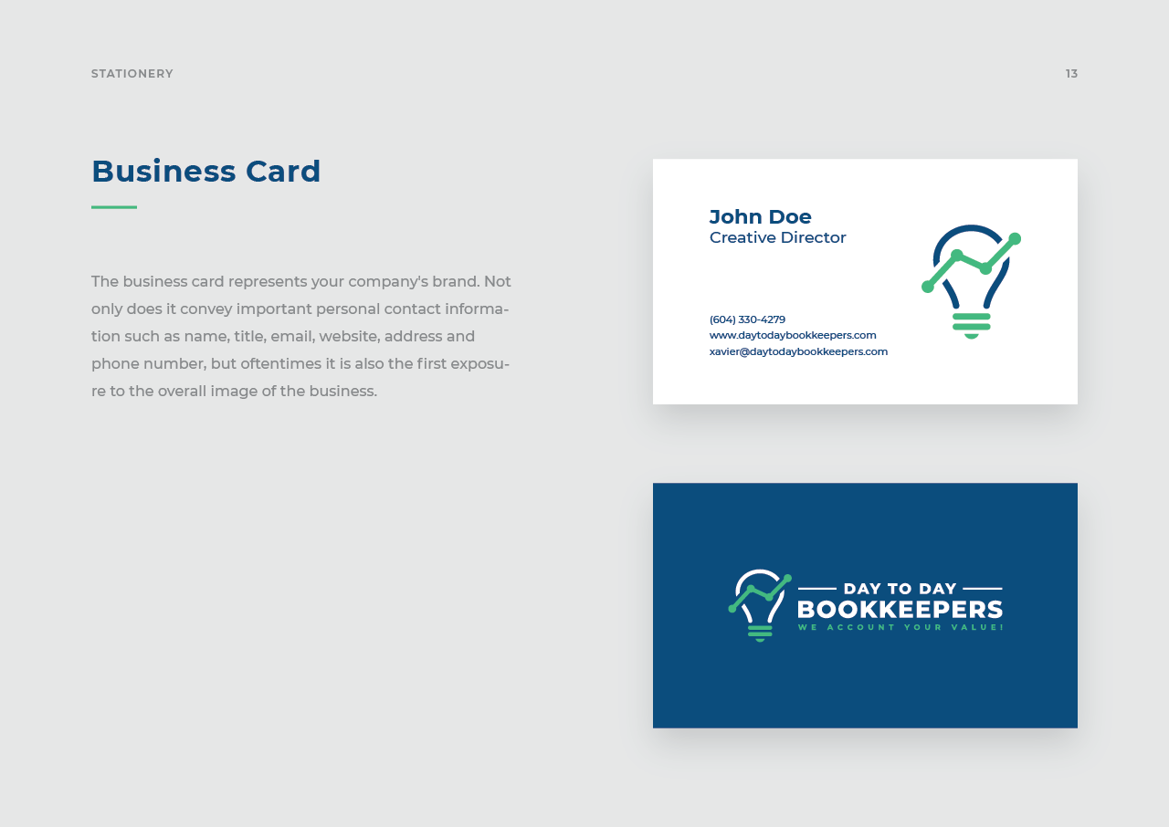
The logo for Day To Day Bookkeepers employs a lightbulb combined with an upward sloping line to effectively symbolize key aspects of the brand’s identity. The lightbulb represents insight, clarity, and innovative thinking—qualities essential for a bookkeeping service that provides detailed and accurate financial management. By integrating an upward sloping line within the lightbulb, the design conveys a strong sense of growth and progress, reflecting the company’s commitment to helping clients achieve financial success and advance their businesses. This combination underscores the company’s role in offering expert bookkeeping solutions that drive positive financial outcomes.
The color palette of green and blue was chosen to enhance the logo’s meaning and visual appeal. Green symbolizes growth, stability, and renewal, aligning with the company’s focus on fostering financial progress and helping businesses thrive. It also conveys a sense of reliability and trust, crucial attributes for a service handling sensitive financial data. Blue, specifically IBM blue, represents trust, professionalism, and competence. As the dominant color, it reinforces the company's commitment to providing dependable and high-quality services. Together, green and blue create a harmonious and impactful combination that conveys both the company's dedication to growth and its strong foundation of trust and expertise.
In-Depth Project Description: A Exploration of the Narrative, Design Strategy and Implementation Approach
Project Overview
This project involved designing a logo for Day To Day Bookkeepers, a company specializing in daily bookkeeping and payroll services for businesses and contractors across the USA and Canada. The goal was to create a logo that effectively represents the company's focus on financial management and growth. The design needed to reflect professionalism and trust, appealing to business owners and home service professionals. The logo should be modern and versatile, suitable for various applications from digital platforms to print materials.
Client Expectation
The client was looking for a mature and geometric logo that conveys a sense of professionalism and reliability. They wanted the design to clearly represent the company's expertise in bookkeeping and payroll services, with a focus on clarity and trustworthiness. The logo needed to be modern and straightforward, avoiding overly complex or whimsical elements. By incorporating geometric shapes, the logo should project stability and precision, aligning with the company's commitment to providing accurate and dependable financial services.
My approach
To meet the client’s expectations, I designed a logo featuring a lightbulb combined with an upward sloping line. The geometric lightbulb symbolizes insight and innovation, while the upward line represents growth and progress, aligning with the company’s role in supporting business success. IBM blue was chosen as the dominant color to convey trust and professionalism, while green adds a touch of growth and reliability. The design is modern and geometric, ensuring a clean and professional appearance. This approach results in a logo that is both mature and visually impactful, effectively communicating Day To Day Bookkeepers' commitment to excellence and reliability in financial management.