ShaneMVP - Website Designer & Developer
Chick'N Jones
Client: bookingh4
Date: May 2021
Category: Logotype + Brand Guidelines
Check out my:
A Detailed Look at the Project Journey: From Initial Vision Through Obstacles to Final Outcomes
Concept
The concept for the Chick' N Jones logo centers around creating a modern and engaging visual identity for an organic chicken brand. The logo features a contemporary depiction of a chicken, designed to appeal to a diverse audience that includes families, Generation Z, tech enthusiasts, and pop culture aficionados. The modern chicken logo is intended to resonate with a broad demographic, emphasizing the brand’s commitment to quality and organic products while also appealing to a younger, trend-conscious audience. The design aims to be both visually striking and memorable, reflecting the brand’s fresh and innovative approach to organic chicken.
Challenge
The primary challenge was to develop a logo that captures the essence of an organic chicken brand while appealing to a wide-ranging audience, including families and younger, tech-savvy consumers. The design needed to balance modern aesthetics with a friendly and approachable feel, ensuring it resonates with both traditional and contemporary tastes. Additionally, the logo had to be versatile enough for various applications, from packaging to digital media, and stand out in a competitive market. It was crucial to create a logo that feels both fresh and authentic, avoiding clichés and ensuring it represents the brand’s values and unique positioning.
Solution
To address these challenges, I created a modern chicken logo with a clean and contemporary design that appeals to the target audience. The chicken is depicted in a sleek, stylized manner that conveys freshness and quality while maintaining a friendly and approachable appearance. This design choice ensures the logo stands out and captures attention across different media and formats. The modern aesthetic aligns with the tastes of Generation Z and tech enthusiasts, while the overall design remains relatable and appealing to families and pop culture lovers. The logo’s versatility and unique style make it effective for branding across various platforms.
Webpage Development
Webpage Development
Webpage Development
Webpage Development
Webpage Development
Delving into the Design: An Exploration of the Meaning Behind the Visual Elements and Creative Vision
The logo for Chick' N Jones employs a modern chicken symbol to effectively capture the essence of the brand and its organic focus. The contemporary depiction of the chicken is designed to be both eye-catching and approachable, reflecting the brand’s commitment to high-quality, organic products. The sleek, stylized chicken embodies freshness and modernity, appealing to a diverse audience including families, Generation Z, and tech enthusiasts. This design choice conveys that Chick' N Jones is not just a product but a part of a modern lifestyle that values both tradition and innovation.
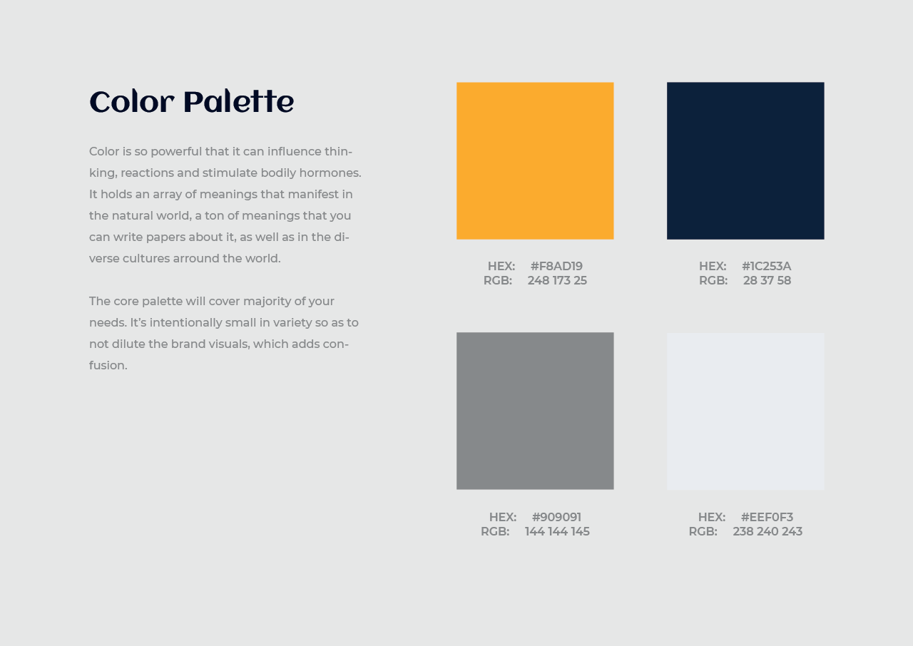
The color palette of deep, almost gold yellow and navy further enhances the logo’s visual appeal and reinforces the brand’s identity. Deep, almost gold yellow represents warmth, quality, and organic goodness. It evokes the rich, golden hues of high-quality chicken and symbolizes the brand’s dedication to providing premium, natural products. Navy, on the other hand, adds a touch of sophistication, trustworthiness, and stability to the logo. It provides a strong contrast to the deep yellow, ensuring the logo stands out while maintaining a professional and modern appearance.
In-Depth Project Description: A Exploration of the Narrative, Design Strategy and Implementation Approach
Project Overview
This project involved designing a logo for Chick' N Jones, an organic chicken brand targeting a diverse audience that includes families, Generation Z, tech enthusiasts, and pop culture lovers. The goal was to create a modern and engaging visual identity that reflects the brand's commitment to high-quality, organic products while appealing to both traditional and contemporary tastes. The logo needed to be fresh, memorable, and versatile, suitable for various applications from packaging to digital media.
Client Expectation
The client desired a modern logo with a slight youthful and playful edge, reflecting the brand’s fresh approach to organic chicken. The design needed to appeal to a broad audience, including families and younger, trend-conscious consumers, while maintaining a balance between modernity and approachability. The logo should be engaging and memorable, avoiding clichés and resonating with both traditional and contemporary audiences. It was important that the logo effectively represents the brand’s values and stands out in a competitive market.
My approach
To meet the client’s expectations, I designed a modern chicken logo that combines sleek, stylized elements with a playful touch. The contemporary depiction of the chicken captures the essence of freshness and quality, while the design remains approachable and engaging. The color palette of deep, almost gold yellow and navy was chosen to convey warmth, quality, and sophistication, creating a visually striking and memorable logo. The deep yellow symbolizes the brand’s organic goodness, while navy adds a sense of reliability and modernity.