ShaneMVP - Website Designer & Developer
Atlantic Championship
Client: atlanticC
Date: January 2022
Category: Logotype
Check out my:
A Detailed Look at the Project Journey: From Initial Vision Through Obstacles to Final Outcomes
Concept
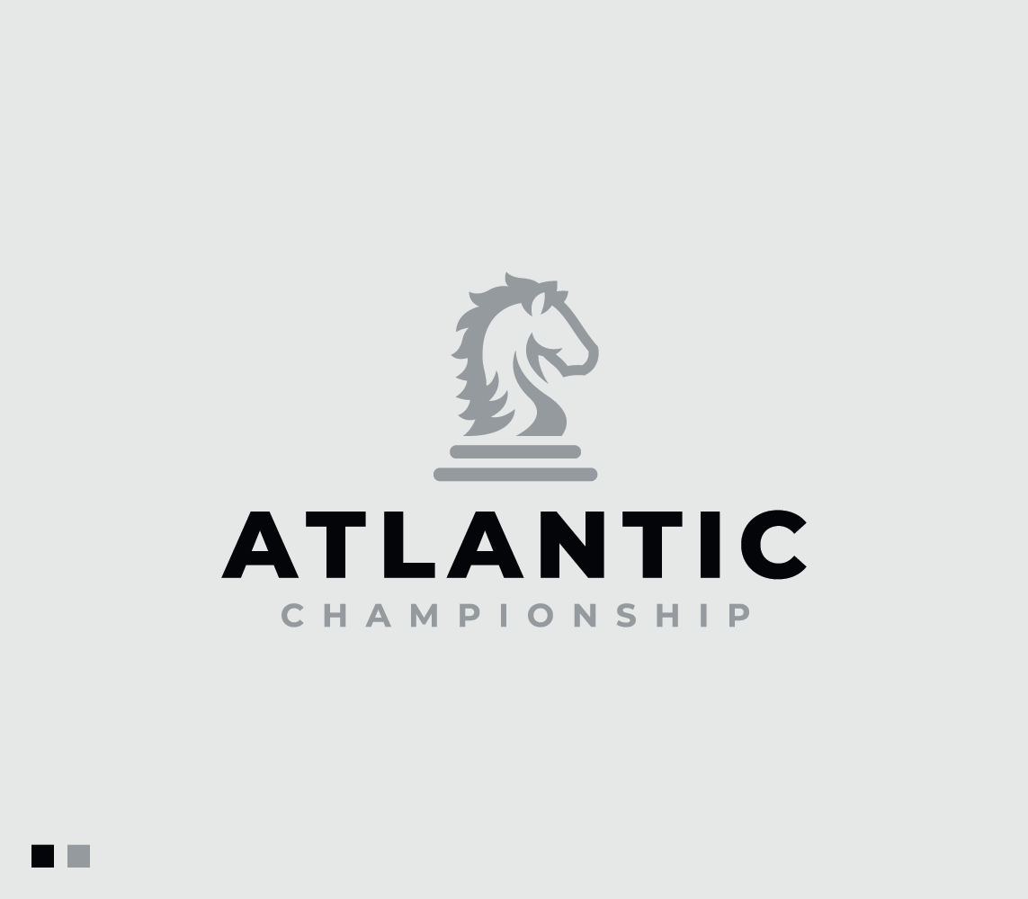
The Atlantic Championship logo features a knight chess piece, a symbol of strategic depth and tactical thinking. The chess knight represents the center’s focus on strategic defense and its commitment to sophisticated, calculated approaches in transatlantic security. The design combines traditional symbolism with a modern aesthetic to reflect the center's expertise and strategic vision in defense.
Challenge
The main challenge was to create a logo that effectively communicates the complex nature of strategic defense while remaining visually compelling and relevant. It needed to encapsulate the essence of the Atlantic Championship’s mission and values, balancing the classic imagery of a knight with a contemporary design to appeal to a professional audience. The design had to be versatile enough to work across various mediums while clearly conveying the strategic focus of the center.
Solution
The solution involved designing a sleek and modern representation of a knight chess piece, integrating clean lines and a strong, dynamic form to emphasize strategic prowess. The design was crafted to reflect both tradition and innovation, aligning with the center’s role in advanced transatlantic defense strategies. The logo effectively conveying the center’s strategic focus and professional approach.
Webpage Development
Webpage Development
Webpage Development
Delving into the Design: An Exploration of the Meaning Behind the Visual Elements and Creative Vision
The Atlantic Championship logo prominently features a knight chess piece, symbolizing the center's deep commitment to strategic and calculated defense planning. In chess, the knight is known for its unique movement and ability to make surprising, strategic maneuvers, representing the center's approach to transatlantic defense—strategic, adaptable, and forward-thinking. The knight serves as a powerful metaphor for the center's role in navigating complex defense scenarios and developing innovative strategies. The choice of grey and black for the color palette further enhances the logo’s meaning.
Grey, often associated with neutrality and balance, underscores the center’s objective to maintain an impartial and well-considered approach in defense matters. It conveys a sense of stability and reliability, essential qualities for a strategic defense organization. Black adds an element of sophistication and strength, reflecting the serious and high-caliber nature of the center’s work. This combination of colors not only ensures a modern and professional appearance but also emphasizes the gravity and importance of the center's mission. The clean, minimalist design of the logo, with its bold use of grey and black, communicates authority and expertise, aligning with the Atlantic Championship’s values and goals.
In-Depth Project Description: A Exploration of the Narrative, Design Strategy and Implementation Approach
Project Overview
The Atlantic Championship project involved designing a logo for a center focused on strategic transatlantic defense. The aim was to create a visual identity that encapsulates the center’s dedication to strategic thinking and defense expertise. The design process centered on reflecting the essence of high-level strategic planning through modern and symbolic imagery.
Client Expectation
The client sought a modern logo that embodies strategic depth and precision. They desired a design that would visually communicate the center's focus on sophisticated defense strategies while maintaining a contemporary and professional appearance. The logo needed to integrate symbolism related to strategy and defense, resonating with a high-caliber audience.
My approach
To meet the client’s expectations, I designed a sleek and modern logo featuring a knight chess piece. This choice of symbol aligns with the center’s focus on strategy and tactical planning. Using a color palette of grey and black, I created a refined and authoritative look, ensuring the logo conveys both professionalism and strategic prowess. The design balances modern aesthetics with meaningful symbolism, delivering a logo that effectively represents the Atlantic Championship’s mission and values.