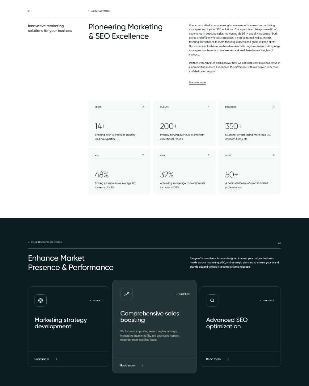
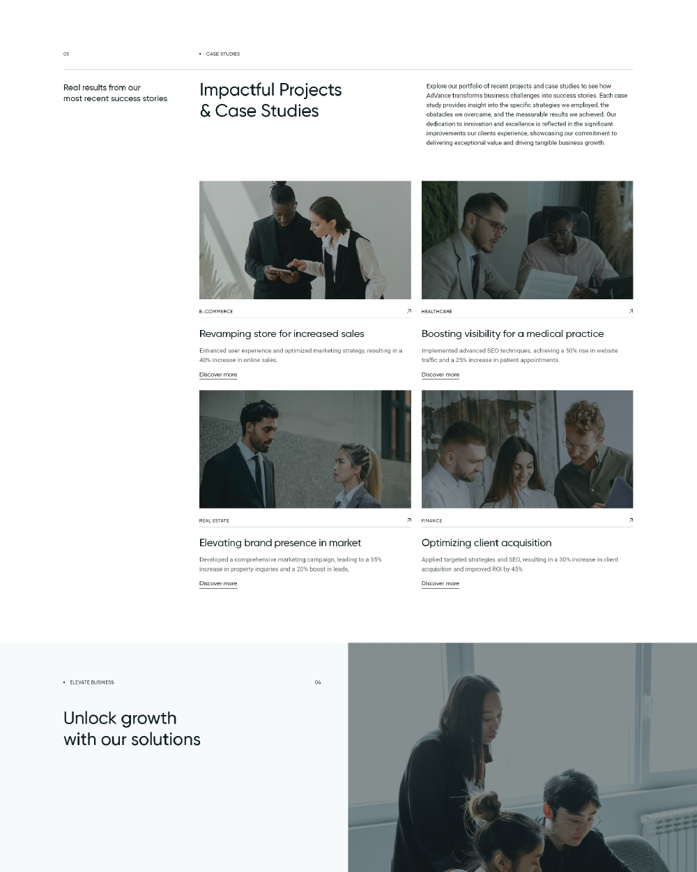
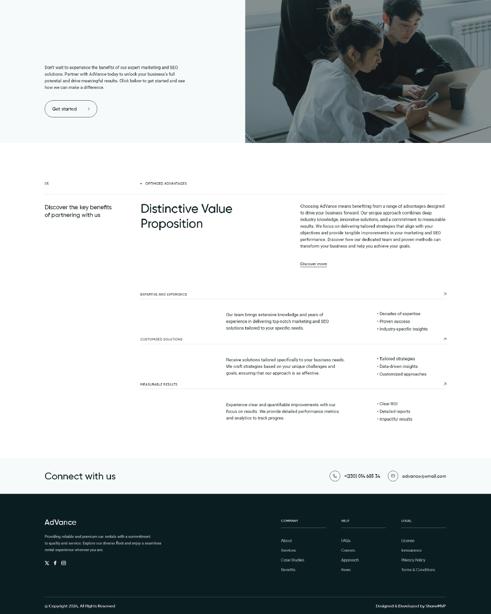
The design for AdVance is crafted with a modern and minimalist approach, emphasizing clarity and functionality. The color scheme, consisting of white, black, and grey, was chosen for its clean and professional appearance, ensuring a sleek and sophisticated look while maintaining a high level of legibility. The typography features a highly legible modern sans-serif font for headings, providing a contemporary and easy-to-read style that complements the overall design. This choice reinforces the brand’s professionalism and makes key information stand out clearly.
The layout was designed for optimal readability and user experience, utilizing ample whitespace to create a clean and organized presentation. This approach ensures that content is accessible and engaging, allowing users to easily navigate and absorb information. Interactive elements were integrated to maintain user engagement and drive action, with a focus on simplicity and functionality. The result is a modern, responsive website that effectively communicates AdVance’s expertise and provides a seamless user experience.


